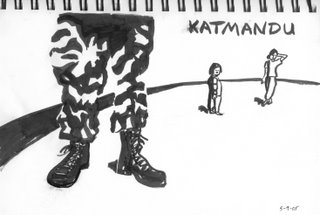
Here's a piece I did last year in my sketchbook based on an image from some magazine--Harper's probably. I was just playing around with geometric shapes and brushwork here, and I like the way it turned out, though when I erased the pencil lines everything smudged and blurred. Which adds a bit of humanity to the image, I guess. I tend to prefer things a little more polished and cold, and that makes a lot of my drawings lifeless, so I've tried to make an effort over recent years to loosen things up, mostly by using brushes to keep me from being to conservative with my line.
I'm going to be posting a bunch of sketchbook pages in the coming weeks, all of which come from the past two years. I've filled up 2 1/2 sketchbooks since then, but for the first three decades of my life I never kept a sketchbook at all. Instead, my doodles and illustrations were always done on random sheets of paper that I may or may not have thrown away.
It's nice to actually have my recent stuff bound together in these sketchbooks, though. I really should have started the process much earlier. That's my sage advice for the day: start a sketchbook, fill it up, then start a new one. It's fun for the whole family!
Tuesday, September 26, 2006
Saturday, September 16, 2006
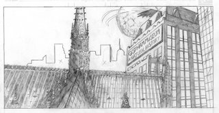
Gotham City
When I was in college, Wizard magazine (which I actually read back in those days, before the interweb), in cooperation with DC Comics, ran some kind of Batman try-out contest. The winner would get something cool--like maybe publication or something. Anyway, you had to draw this Batman sequence that they gave you the script for. The first panel described a moonlit Gotham City, and then the other panels went on to describe the Batman swooping down and I think maybe Man-Bat was in the sequence? I really don't remember the details. It was during the time of the Azrael Batman, by the way, so his costume was all Robocoppy, which definitely detracted from any kind of moody effect I wanted to achieve.
Because of this, or because I never finished anything I started back then (see Mr. Potato Head for details), I only drew the first panel for the contest. This is the result:
I wanted to amp up the gothic imagery in the cityscape, and what could be more gothic than Notre Dame cathedral? So I plopped it right down in the foreground and left the more modern buildings in the middle ground. I like how it turned out. It's certainly the most detailed architectural rendering I've ever done, and although I'm not happy with the old-school cape effect up top (looks more like Bob Kane than even I intended), or the way the right corner of the cathedral lines up with the front corner of the Natural History Museum (the cathedral should extend a bit further to the right), I think it's a cool image.
I mean, it's Gotham City! Right?
Although if I had to do it again, I'd definitely put some kind of giant dinosaur skeleton on the roof of the Natural History Museum. Nah, that would be dumb.
Friday, September 15, 2006
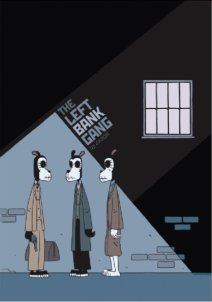
Recommended: The Left Bank Gang
Last week I read Jason's new graphic novel, The Left Bank Gang. This Fantagraphics edition needs more effective glue (my binding has already cracked and the cover is nearly coming off), but the book is full of quality. I've never read any of Jason's longer work before--just some short pieces here and there. I was put off by his anthropomorphic animals and his seemingly expressionless style. I was wrong to dismiss him before.
This book, which tells an alternate-reality tale of Hemingway, Fitzgerald, Joyce, and Pound's self-imposed exile in France. In this version, the four are cartoonists and, running short on funds, they decide to pull a heist. After that point, the story turns into an homage of Kubrick's The Killing, complete with non-linear storytelling.
Honestly, though, the heist is only the very last part of the book. The first 2/3rds deals with the frustrations of the characters, and the naturalistic but oblique dialogue works perfectly to capture the feel of that lost generation.
It's a short book, only 64 pages, and the Kubrick homage may be a bit too faithful to the source, but it's an excellent read with clean, expressive art by Jason. I was wrong about his work before; he's a wonderfully expressive artist. I highly recommend this book to you.
Tuesday, September 12, 2006
Ninja Wolf in Space
In 2005, I self-published four issues of Ninja Wolf along with some other sweet minicomics. (They're all still available for a buck apiece, so if you're interested, send me an email.)
Anyway, this illustration is NOT featured in any of the Ninja Wolf issues. It was done on an oversized art board just for fun, and once I started drawing it, I knew that "Ninja Wolf in Space" had to be the title (and plot) of the first Ninja Wolf movie. So think of this as a teaser for such a film, coming your way no later than 2026.
Comic Book Scorecard: Week of 9/06/06
This week was lighter than last week, both in terms of quantity and quality. Here we go:
Uncanny X-Men #478, by Brubaker and Tan. I've seldom liked the X-Men. I enjoyed the Claremont/Cockrum/Byrne run. I loved the Morrison, Quitely, etc. run. I respect the Whedon, Cassaday work on Astonishing. I thought the second movie was pretty good. That's about it for me and the X-Men. I own a lot of X-Men comic books, but most of them are weak, incomprehensible, or dull. This new 12-part series by Brubaker and Tan is still too early to judge, honestly. Issue #478 is part 4 of the series, true, but that's still really just the beginning of Act II--I know the storyline is headed toward some huge battle between Vulcan, The X-Men, and the Shi'ar Superguardians, but it's a bit slow getting there. I like that it deals with the Shi'ar. I like that it's not mutant angst. I like that it's better than most X-Men stories already. But I hope Brubaker can pull it all together into something great. Grade: B-
52 Week Eighteen, by the usual peeps. I have been reading Shadowpact and the continuity between this series and that series has completely baffled me. Wasn't the Shadowpact team trapped in that city withing a bubble for the entire year. The same year 52 is supposed to take place? I thought so. Am I wrong about that? Then why are Shadowpact members appearing in this series all of a sudden? Will someone please help me out here? Anyway, I liked this issue, otherwise, mostly because it dealt heavily with Dr. Fate's helmet. I think Dr. Fate is one of the best, most underused characters in the DC Universe, and it's mostly because his helmet is so damn cool. Seriously, his helmet is enough to make me enjoy a comic book. That's more than a little weird, right? Grade: B
Atom #3, by Simone and Byrne. Ugh, I still HATE the "footnotes" that Simone throws in every once in a while. I think the footnotes are her awful attempt at metafiction and/or humor, but they just don't work. They are distracting, uninteresting, and unfunny. I actually emailed her after the first issue to beg her to please get rid of the horrible, horrible footnotes, and she said in her reply that she's going to continue using them, but use them less. She's just being stubborn. I'll bet you that by issue #10 the footnotes will be long gone. They are so very bad. Meanwhile, the story is not too shabby, and Byrne's art looks pretty good in this issue. We have a Lovecraftian monster, a new Giganta (is she the same Giganta from other DC comics? I have no idea), and a new villain who is a shrinking assassin called Dwarfstar. If a shrinking assassin named Dwarfstar sounds cool to you, then you are smart, because it is WICKED cool. Grade: B+ (would be an A- if not for those footnotes!)
Mystery in Space #1, by Starlin and Davis. I liked the Shane Davis artwork a lot more than I thought I would. I'm pretty much a clean-line type of guy, and the 90s Image look doesn't sit well with me. Yet, this week I bought a couple of titles that used that style quite effectively. It's too early to judge the overall storyline, but the first issue rejuvenates the old Captain Comet character and updates him TO THE EXTREME. That's actually not a joke. That's what really happens. But, still, I like swashbuckling space adventures, and Starlin is known for that sort of thing (I miss Dreadstar, don't you?). The back-up story, "The Weird," seemed just kind of pointless, though. And I always thought Starlin's "Weird" costume design was way off--he's supposed to be this alien being of immense power, yet he looks like a circus performer with a stylized ninja costume. That IS weird. Grade for the Captain Comet section: B; Grade for The Weird: D
Detective Comics #823, by Dini and Benitez. This is the other comic I bought that had 90s Image art, but yet I liked the style quite a bit. It's like Todd McFarlane had a love child with Bart Sears and Art Adams was the godfather. If that makes any sense to you, it probably doesn't sound like a pleasant sight, but it is. It works here. I particularly like the look of Batman in this story. It's a good look. Trust me. The Dini story is decent, but not brilliant. I like the savage portrayal of Poison Ivy, but the "villain," the Harvest, is not great. The ending implies that the ridiculous Harvest will inevitably return someday. I hope not. Really. Grade: B
Marvel Team-Up #24, by Kirkman and Kuhn. I have probably told you this before, but Robert Kirkman is the best old-fashioned superhero writer working today. He's not a fancy genius like Morrison or anything, but in the classic Stan Lee mode, or Claremont mode, or whatever old-school writer you like, you get Robert Kirkman. He just tells a good story and seems to have fun doing it. That's why I like this series, and I'm sad that it's ending next issue. But the story he tells this week is a great one, with the final battle between Freedom Ring and Iron Maniac (see--look at those names, they are absurd, but Kirkman doesn't care--he doesn't justify them--he knows he's writing a comic book and he just goes for it). You know what, I just like that there's a crazy alternate reality Tony Stark running around calling himself Iron Maniac. That's enough to make me happy. The excellent narrative is just icing. Grade: A
Y the Last Man #49, by Vaughan and Guerra. Yorick's quest seems to have hit a bit of a lull here. There aren't any interesting action sequences here, nor any shocking revelations, nor any charming dialogue. I think the problem is that Yorick himself doesn't seem to know what his next step will be. Since issue #1, he's been looking for his girlfriend, but now he seems puzzled about what to do next. So maybe the issue simulates his lack of direction. Either that or it's just a weak issue. I just hope that Vaughan recovers and gets us on track quickly for the series conclusion (issue #60?). Grade: C-
Agents of Atlas #2, by Parker and Kirk. Jeff Parker is coming on strong. He's making a mainstream splash on this series and his work on the Marvel Adventures: Avengers title (which I haven't read, but I've heard good things about). Agents of Atlas, though, is looking good so far. I like the premise (the actual pre-Marvel heroes reuniting in the present day to fight their old nemesis--the racist characature of evil known as Yellow Claw), and I like the characters, and I like the pace of the story. The artwork is pleasant too. Good stuff all around. Grade: A-
Battler Briton #3, by Ennis and Wilson. This is another series I'm not going to read until I get a whole bunch of issues, largely because I have no frame of reference on these old British characters, and I need to sink my teeth into a pile of the comics before I get my bearings. Grade: Incomplete
That's it for this week!
Monday, September 11, 2006
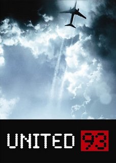
United 93
I understand the concept of catharsis, but I rarely experience it. I look at art, whether it be paintings, fiction, or movies, from an intellectual perspective. I appreciate and enjoy style and technique. I savor the moment when an artist tries something new and creates innovation. I love things on an aesthetic level. But I'm rarely moved. Emotion doesn't tend to factor into my appreciation of works of art.
United 93 is an amazing exception. This film is a work of art which not only bowled me over with its handheld aesthetic, but it also provided an emotional catharsis that I can't remember experiencing before in my life. If you asked me today about my favorite movies of all time, this one would near the top, because I can't think of many more perfect blendings of intellectual and emotional pleasure. Pleasure's the wrong word, of course, because this movie is brutal and painful. But to watch such a masterful film, even one that tears you apart as you watch it, is a pleasure of a sort. It's horrible but beautiful, and it's not beautiful in the way that most movies are beautiful--it's not bright and pretty and colorful--it's beautiful in the sense that it perfectly recreates a time and a place that we need to revisit.
The movie is surprisingly devoid of political sentiment even though, contrary to what I've read about the movie, it doesn't take place entirely within the confines of United Flight 93. In fact, the movie jumps from location to location, providing a context about what we knew and what we didn't know on this terrible day five years ago. The contextual information is part of the catharsis. We need to see that second plane strike the World Trade Center, even if we don't want to, if the full impact of the events is to be felt (not only by us, but by the characters in the movie).
(Future generations will watch this movie, and they will not feel the devastation we feel when we see that plane hit the tower--it crushes us because we experienced that day--when we see the image, we recall the feelings we had when we first heard and saw what had occurred--our children will not have that context--so I wonder what they will make of this film. Will they see it purely in intellectual terms, as I usually do when I watch movies, or is the film good enough to provide catharsis to someone born after the events of that day? I don't know, but I suspect the greatness of this movie will not last. It will become just another movie about a historical event when our children are old enough to watch it.)
United 93 has no stars and no main characters. It is not a conventional narrative. Yet it is a movie that everyone should see because of its power and truth (and I don't mean literal truth, although it apparently is based on the facts that could be pieced together--I mean emotional truth). Watch it at night, though, because you won't be very useful for the rest of the day.
Sunday, September 10, 2006
Hey, Football!
In honor of the start of a new football season, I'm tossing out a treat from my old pile o' art. Here's Michigan Heisman Trophy Winner Desmond Howard as drawn by me all the way back in 1991. My brother was always a huge Michigan Wolverines fan, and this iconic image of Howard, copied from some issue of Sports Illustrated I'm sure, has always been one of my personal favorite football images ever. I love how this illustration turned out, which explains why I still have this piece in my possession and my brother has nothing. Ha, ha, sucker, too bad for you!
Maybe I'll draw a new picture for my brother's next birthday. A picture of Brian Urlacher fighting an army of ninjas! It could be like the awesome football fight in Flash Gordon! Ah, football. Good times.
Saturday, September 09, 2006
On Steve Yeowell
When I expand my Sequart.com Grant Morrison columns into a book, I'm going to add brief sidebar essays on the major artists Morrison collaborated with on the various comic book series and graphic novels. Although the focus of the book is a writer, I can't ignore the visual side of the stories. That would be ridiculous. So I'm going to post my thoughts on these artists on this blog from time to time to get ready for the book (which was supposed to be ready in time for Comic-Con New York, but that's not very realistic--summer 2007 is more likely). So here we go:
SPOTLIGHT ON STEVE YEOWELL
After working as a fill-in artist on the Zoids strip Grant Morrison was writing, Steve Yeowell soon joined Morrison to launch the pop music "superhero" strip Zenith in the weekly 2000 AD magazine. Yeowell was the only artist to work on Zenith through all four phases of the story, and Morrison was obviously pleased with the look of the series because he launched four more comic book series with Yeowell as his artistic collaborator: The New Adventures of Hitler (1990), Sebastian O (1993), The Invisibles (1994), and Skrull Kill Krew (1995). In addition, Yeowell worked as a fill-in artist during Morrison's Doom Patrol run.
The appeal of Yeowell's artwork lies in his ability to ground extraordinary characters by placing them in a solid context. He tends not to use extreme angles or dynamic perspective to tell the stories, but rather, he uses clean pen lines and solid blacks to give bold form to the proceedings. This is a particularly effective technique when working with Grant Morrison, since Morrison's scripts are full of fantastic invention and hallucinogenic narrative sequences. Yeowell's artwork adds a realistic context for Morrison's outrageous stories.
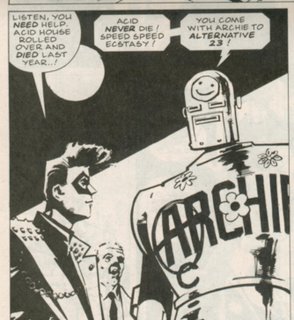
Consider this panel from Zenith: Phase 3:
The dialogue speaks of alternate dimensions and yet the poses are static and firm. There's no wild gesticulation on the part of Zenith or Robot Archie. And the background is not overly detailed--it doesn't distract from the foreground characters. In fact, Yeowell provides no background at all, save a bold black triangle around a white circle which gives a bit of graphic impact and compresses the frame to emphasize the main figures. The only dynamic aspect of the panel is the facial expression of Zenith's agent, Eddie, who looks at Robot Archie, from his position in the middle ground, with a look of complete shock. His expression underscores the dramatic nature of Archie's revelation, but because it is constrained to a relatively small space in the middle ground, his emotion doesn't overwhelm the panel.
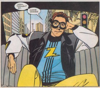
In Zenith: Phase Four, he was granted the use of color, and although his pen and ink technique has changed, his panel compositions remain boldly understated:
Yeowell doesn't fill the panel with needless crosshatching or distracting details. Even the background, which he's actually drawn this time, is composed of simple geometric shapes which provide the illusion of dimensionality without drawing attention away from Zenith's face. Yeowell once again uses a solid black geometric shape (around the rear window) to frame the foreground figure, and the figure itself is posed naturalistically. The "camera angle" from which the scene is shown is nearly identical to the example above. The reader sees the image not from some absurdly dramatic perspective, but instead, the figures are seen head-on, and we are looking at them at about shoulder or chest level, giving them a slight appearance of superiority, but none of this is highly exaggerated. It's subtle and effective and tells the story with clarity and grace.
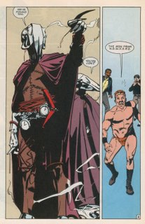
Even in the insane context of theDoom Patrol series, Yeowell provides clear storytelling and figures who are grounded in a simplified, but effectively rendered, reality:
His depiction of the Men from N.O.W.H.E.R.E. gave them a solidity that other artists weren't quite able to duplicate. Most other artists would obsess over the details of the costumes, distracting the reader with obsessively rendered chain-and-pocket-watch-belts, or overly ornate helmets. Yeowell suggests such detail but doesn't distract us with hundreds of tiny lines--instead, he uses blacks and negative space to add depth and texture. On this page, the lack of background information not only emphasizes the figures, but it provides a sense of disorientation for the characters as well. Flex Mentallo, in the right panel, is literally un-grounded. He is lost, emotionally, intellectually, and physically as he floats in the empty space provided by Yeowell. Notice also that the camera angle is again very similar to the two examples from the Zenith panels. We are slightly below the threatening Men from N.O.W.H.E.R.E, and slightly above Flex Mentallo and company, but not by much. In neither case are the figures shown from some extremely distorted or dynamic angle.
Steve Yeowell is the antithesis of the Jack Kirby model of comic book storytelling and the Image tradition of extreme rendering. That's why I personally disliked Yeowell's work when I first saw it as a teenager. It was so different, so apparently flat, from what I was used to seeing. But that's also why I enjoy his work so much now. I think Yeowell is one of the most interesting and effective artists working in the comic book medium, and I've only been able to appreciate his contributions now that I've matured enough to recognize his glorious subtlety.
Friday, September 08, 2006
Frank Miller and I
In addition to my ungodly love for any archive editions, I can't resist the higher-end Absolute Editions published by DC either. These things are massive, oversizes hardcover editions of the greatest works in recent comic book history, and they come complete with extra pages of commentary, or artwork, or whatever they decide would be cool. I have several of these suckers so far, and with so many new ones being released over the next year or so, I'm doomed to poverty.
The most recent one, by the way, is the Absolute Dark Knight. My recent posts may lead you to believe that I loves me some Batman. That's not exactly true. I actually prefer Superman. In fact, if I had to rank superheroes (which is stupid for me to even think about, because I buy comic books for the creators, rather than the characters), I would place Green Lantern and Flash even above Superman. So I'm not a big Batman guy. But I do love Frank Miller, so I couldn't resist this giant book, which collects The Dark Knight Returns along with The Dark Knight Strikes Again and some other supplemental sketches and original proposals, etc. I haven't actually read this volume yet, so I'll hold off on commenting upon it in more detail. I've read the stories several times in earlier printings, but it's been years since I've revisited either, so I'll let you know if my previous opinion still holds up. (For the record: my previous opinion would be that Dark Knight Returns is savage and brutal and shockingly good and Dark Knight Strikes Again is sloppy but still excellent--and I've always thought the negative criticism it received was due to expectations that were unrealistically high and inconsistent shipping dates when it was first released. But we'll see if that opinion holds.)
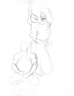
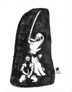
The point of this post is that I've always loved the stark, blocky, boldness of Frank Miller's style, and in going through my older artwork, I found an early tribute to his work. I thought this was interesting because it actually shows a bit of my process, and it shows how pathetically unoriginal I was back in those days (as opposed to today, when I'm expertly unoriginal). Here's the rough sketch I drew over a dozen years ago:
It's clearly based on Miller's Ronin, which is the story a science-fiction samurai. I might not have recognized the sketch as a Miller homage, though, if it wasn't accompanied by my finished piece:
Now this looks good, right? Except it's TOTALLY copied from a Miller illustration. But you can see that I at least improved my plagiarism between the sketch and the final, inked drawing. I can't remember exactly what I was thinking at the time, but I knew I thought of this as a "study" of Miller's drawing style, and for some reason I got the scale completely wrong when I did that first sketch. Anyway, I still love Frank Miller, but I don't copy his work anymore. Maybe I should. Maybe it would help. And, by the way, I also found other examples of times I "swiped" a pose or a design from another artist, and I will be posting them someday. For now, though, marvel at the awesomeness that is Frank Miller, as interpreted by me.
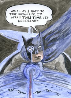
The Callahan Gallery--Bob Kane's Batman
I was reading the "Dark Knight Archives Volume 1" (which reprints the very first four issues of the "Batman" comic book) a few months ago, and I came across a panel where Batman's flying a plane, gunning down the bad guys. You just don't see that much anymore. So I was inspired to to a color illustration based on the panel design. It's not my best work, but I had fun slapping some watercolors on a piece of paper. The words Batman says, by the way, are exactly what he says in that early story. It's my tribute to Bob Kane, Bill Finger, and the great Jerry Robinson.
Wednesday, September 06, 2006
An Old Drawing
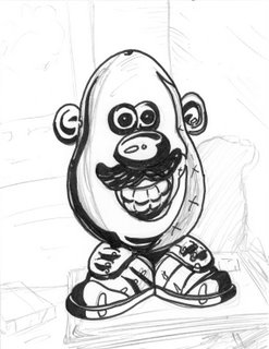
I uncovered this unfinished drawing in my pile o' stuff and I can remember exactly where I was and what I was thinking when I drew it. It was the summer of 1990. I had just graduated high school, and I drew this in my bedroom in my parent's house on Greylock Estates. I'd written a partial script for a comic book story. I knew the opening sequence at least, and I began to draw. The first page was supposed to be a Mr. Potato head repeated several times. After the third or fourth static image, blood was supposed to splatter on the face of Mr. Potato head. A murder had been committed in the room. In the final panel on the page, we might see a shadowy figure walk in front of "the camera."
It was an Alan Moore-type of storytelling device. The stationary POV. The slow build. The disturbing juxtaposition of childhood innocence and brutality. I pencilled one panel. I partially inked it. I grew bored with it, and never returned to the story idea or the drawing. That's pretty much how I operate. I have pages and pages of unfinished drawings, stories, even novels. Does everyone do that, or is it just me?
Tuesday, September 05, 2006
10 Reasons why The Legion of Super-Heroes RULEZ!
I resisted my love of The Legion of Super-Heroes for years. I looked at the covers, thought they were awesome, but I couldn't get past the whole "boy/lad/lass" thing in their names: "Ultra Boy, Shadow Lass, Saturn Girl, Element Lad, etc." But they did have cool powers, and they were from the FUTURE. So I was always tempted. And, of course, there were about 8 billion characters to learn about, which was intimidating. Yet there was always something alluring about those shiny 30th Century heroes.
Even before I ever succumbed and picked up my first issue of the series (which was pretty late--I bought the 4-part "Universo" story by Levitz and Laroque which was in the middle of the baxter series, and I'd been reading comics for almost a decade by then), I had purchased some Legion stuff for the DC Heroes role-playing game Mayfair produced. That was a great role-playing game, by the way. Although I don't think I ever actually played it. I just bought every book that came out and memorized the backstories of all the characters and learned their powers and abilities. It was great to walk into a bookstore at some far-away mall (we didn't have a local mall back then) and see a new DC Heroes module or sourcebook on the shelf. What a rush. It's good to be a geek!
Anyway, I finally started picking up the Legion of Super-Heroes comics in the late 1980s, and I bought a bunch of back issues at that time and read it faithfully for a few years until the 5-year gap stories which sounded good to me in theory, but bore so little resemblance to the Legion I'd grown to love that I soon lost interest.
But when I got heavily addicted to the Archive editions last year, I splurged and bought all 12 Legion Archives. And since then, I won a huge 500 comic lot on ebay (all Legion issues--for super-cheap--like 5 cents per issue) and between what I already owned, the Archives, and that ebay lot, I have about 95% of all Legion stories ever published. I still haven't read them all. I've read the 12 Archives, and clumps of stuff between then and now--but I need to set aside a few weeks to get through the rest of the issues. A few months, actually. But the early Archives stuff is so fantastic, I don't think any of the stuff since then can possibly top it.
So this list might be updated once I get totally caught up, but for now, let me present to you THE TOP 10 REASONS WHY THE LEGION RULEZ (WITH A CAPITAL "ULEZ"):
10) Jim Shooter wrote his first issues when he was 13 and he added Karate Kid to the team. Karate Kid's power: Super-Karate!
9) Lighting Lad died in an early issue. No he didn't. It was Chameleon Boy's shape-changing pet Proty who died in his place! Genius!
8) The Legion of Substitute Heroes. They made you laugh and they made you cry. But they kept coming back, didn't they?
7) Interlac. It was like English at first. Then it was like English but with letters FROM THE FUTURE!
6) Tiny little men implanted in the ankle for surveillance. If you read this issue, you will never forget it.
5) Starfinger! Who was actually a brainwashed Lighting Lad with a clamshell helmet! Yes!
4) John Forte. Stiff figures and out-of-scale backgrounds. Yet his art defined the Legion and it is my personal favorite of that era. I like the awkwardly posed figures! They're goofy teenagers from the future!
3) Edmond Hamilton. The greatest of the Legion writers. He's not nearly as famous as he should be. Plus, his wife co-wrote "The Big Sleep" and "The Empire Strikes Back." Nice score there, Edmond.
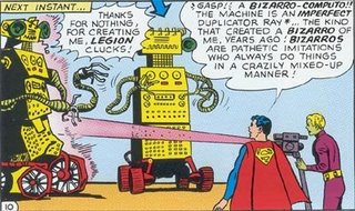
2) Computo. A giant yellow cash register on wheels (with tentacles)--a sentient computer bent on world domination!
1) Bizarro Computo! Created by Brainiac 5 to defeat Computo. It failed miserably. But how awesome was it while it lasted? As awesome as you can possibly imagine multiplied by infinity! Just take a gander:
Ah, I really do love this stuff.
Monday, September 04, 2006
Doodle
I doodled this while I was waiting for something to download. I like that it's just drawn on lined paper with a Sharpie. It gives it that "drawn-by-a-little-kid" look, except it's cooler. Actually, the characters look suprised to be caught on lined paper. They're a little embarassed by it. And they should be. As my close friends know, I don't even use lined paper to write on. I write on blank paper (and draw, apparently, on lined paper). Lined paper is for suckers.
I should write a story about these two characters. I'll let the readers come up with their names. You have until September 30th to name them! Go! (I'll select the best name and write a wicked sweet illustrated story to be posted here.)
Sunday, September 03, 2006
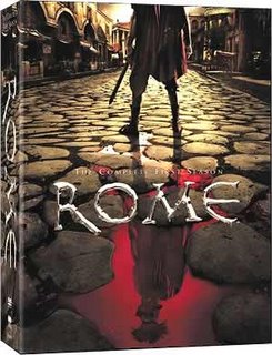
Recommended: Rome
This DVD came out a few weeks ago, and because I was lucky enough to have nothing better to do (ankle, remember?) than lie around on the couch, I was able to watch the entire season in a 24 hour period. While it's not quite as good as Deadwood because it's a bit too constrained by actual events, it's definitely worth watching. The Caesar stuff is fascinating, of course, and the interpretation of Brutus is different from anything I've ever seen before (and MUCH more interesting), and the two female leads are wonderfully vicious, but the best parts are (a) Octavian--who is played by the brilliant young Max Pirkis, and (b) the two Rosencrantz and Guildenstern-ish characters of Lucius Vorenus and Titus Pullo.
I call them Rosencrantz and Guildenstern-ish not because they are ridiculous and pathetic (they are not), but because they play a central role in EVERYTHING (good and bad) that happens to Caesar. They are instrumental in winning the war againts the Gauls, they strike the first blow in the battle with Pompey, they are the ones to find the treasury gold, they find Cleopatra, etc etc etc. If I liked Forrest Gump I would say they are Gump-like as well, but since that movie is absolute crap, I'll just say that they are two wonderfully interesting characters who find themselves living inside giant historical events. Lucius Vorenus is the serious boy scout, and Titus Pullo is the unsophisticated thug, and their story is the real story of Rome.
Bottles of Colored Ink
When I was a teenager, as a Christmas present I received a set of colored ink bottles. I had been drawing a lot around that time, and I'm pretty sure the ink set was part of a larger "theme" that went along with a drawing table I also received. My mother always loved gift-giving themes. Like, she wouldn't just give one present to someone. She'd have a central present, and a lot of satellite presents that somehow went along with it. If the central present was a hockey stick, she'd get you gloves of course, but also like Gatorade or something to go with the athletic "theme." Or maybe a little chocolate goalie or something. It was never just the obvious tie-ins--she would always go above and beyond.
So I probably got some brushes and some pens and pencils to go along with the table and the ink. But I had never used colored ink before. I had given up on color illustrations sometime back in elementary school, when I moved from crayons to colored pencils. Colored pencils looked nicer, but the tint was always too soft, too pastel for me. And watercolors? Forget about it! I couldn't figure out how to keep those from making the paper all wet (I was using typing paper--what did I expect?). So I had basically stuck to black and white--pen and ink--since then.
I didn't know what to do with these colors of ink. I tried using them to color in a pen and ink drawing, but that was a disaster. It looked like paint-by-numbers, except the ink ran too much. I threw that piece away, I'm sure. But after ignoring my colored ink for a few months( I did use the bottle of black ink from the start--but the other ones stayed in their individual little boxes), I decided to play around and just "paint" something with the colors. I used one of my brothers "Zoo Books" for reference, and I came up with this:
I hated the result at the time. I may have tried one or two other small projects with the colored ink, but I basically just put it on the shelf and forgot about it. A decade later, when I moved into a new house with my wife. I unpacked all my art supplies and found the package of colored ink still nearly intact (the bottle of black ink was long gone). I opened the bottles to find that the ink had completely dried up, so I dumped the whole package in the trash. I hadn't thought about the bottles of colored ink since then, until I came across this old owl.
Today, I look at that illustration and admire what I did. I really like it now. I like how I didn't fill up the drawing board with color--I used the whiteness for effect. I like how I zoomed in on the owl's eyes, but not perfectly--they aren't centered. I like the use of purple to give a stylized look to the image. Why was I so disappointed in the way it turned out when I was younger? I'm sure there's an important life lesson here somewhere.
Saturday, September 02, 2006
Comic Book Scorecard: Week of 8/30/06
I read a ton of comic books, as you've no doubt figured out. I'm going to try to give capsule reviews and grades to everything I pick up each week. (When I get my comics home, I don't just read them in random order. I stack them up so I can read what I'm most excited about first, and then I put the rest of the superhero stuff next and the non-cape stuff last--usually. The list below is the order in which I read the books.) Here goes:
Solo #12, by Brendan McCarthy. This is the last issue of the series unfortunately, because it was consistently one of my favorites. McCarthy is an astounding artist, and although not every page of this comic is a masterpiece (there are a few one-page sequences that are nonsensical, and not in a good way), the bulk of this issue is pure genius. It's worth buying just for his take on The Flash and his brilliant Batman tale. Grade: A-
All-Star Superman #5, by Morrison and Quitely. Wow. I think this is the best comic book published these days. I wish Quitely's art wasn't digitally inked (when he inks himself, the work is perfect--but I realize that he'd be unable to meet the deadline if he did), but the story's amazing. Best Superman comic book in decades. Grade: A+
52: Week Seventeen, by Morrison, Rucka, Waid, Johns etc. One of the better issues of the series. I love the Animal Man, Adam Strange, Starfire subplot, and that gains more prominence in this issue, so I'm all for that. I'm not a Lobo fan, but his appearance in the story is fun and appropriate. Good stuff this time. Grade: A-
Action Comics #842, by Busiek, Nicieza, and Woods. Pete Woods has developed into one of the best superhero artists working today. And the Dave Gibbons covers have been great on this title. Even though I looked forward to reading this issue, I was still surprised with how good it was. It's not transcendently brilliant like Morrison's Superman stuff, but it is an excellent take on the character and this story is filled with several enjoyable sequences. It had stuff I even had to show off to my son because I thought he'd find it cool. And he did. Grade: A
Young Avengers & Runaways #2, by Wells and Caselli. Another solid issue. Wells does a nice job humorously pointing out the similarities between the two teams, and the ending is a shocker. The art is a bit fuzzy for me--I like a bolder black line, but it's shaping up to be a good series overall. Grade: B+
Teen Titans #38, by Johns and Ferreira. This title has been weaker lately than it was pre-Infinite Crisis. I don't mind the new team or the new focus on solving the mystery of what happened during the gap or any of that stuff. It just feels like it's progressing slower than it should. A lot slower than the pace of earlier issues in the series. This book did feature a cool double-page spread showing the rotating cast during the one-year gap--it was fun to see, and it's another thing that my son really liked because it brought several characters from the animated series into the main title. But, other than that, not much going on. Grade: C
X-Men #190, by Carey and Bachalo. I like Carey's superhero work so far, and Bachalo is always great if he's paired with a writer who can keep him focused (which seems to be the case here). I despise Cable, but his appearance is well-written and makes sense in the context. I'm looking forward to seeing where this storyline is headed. Grade: B
The Trials of Shazam! #1, by Winick and Porter. Man, I really dislike Judd Winick's writing. He's not awful, but he's aggressively mediocre. And yet he gets to write such important characters. Captain Marvel deserves a big comeback. This isn't going to be it, I'm afraid. But I'll probably still buy the rest of the series anyway. (It's called an addiction.) Grade: C-
Superman/Batman #29, by Verheiden and Van Scriver. I really don't know what's going on in this storyline. I can't recall the previous issue. Did I miss it? Am I supposed to be confused. It's baffling to me because I feel like I should know what's happening, but there's just a lot of fighting between the superheroes and then Dark Kilowog shows up. Beats me. Grade: C+ (because I'm assuming that everything will be explained OR that I did, in fact, miss an issue)
Ultimate Fantastic Four #33, by Carey and Ferry. Yeah, now this is good. Here's a case where nobody has any idea what's going on. We know some crazy alien super-beings have shown up on Earth, but we don't know their motives and we're not supposed to. Ferry's art is slick (if a bit rushed) and Carey knows how to keep things interesting. Like his work on X-Men, it's good stuff, and it looks to be building toward something. I just hope it pays off. Grade: B+
JLA Classified #26, by Chaykin, Plunkett, and Nguyen. Ugh. This is terrible. The last storyline was really unreadable and the only reason I bought this was because Chaykin wrote this one. But it's going to be a 6-parter and I don't think I'll be able to stick around to find out what happens. The problem is that the story is too heavy-handed in its politics, and it features huge chunks of dull narration, plus it takes the JLA out of costume to send them on a covert mission. I hate to see superheroes out of costume. It doesn't make it more "realistic," it just makes it more bland. Grade: F
Justice #7, by Krueger, Ross, and Braithwaite. I'm going to have to read this all in one sitting when it finally wraps up. Two months between issues is too long to keep the narrative momentum. It's basically just one long sequence from issue 1 on, as far as I can tell, so reading each individual issue with such a gap between really makes me lose interest. I think Ross is a great artist, but Braithwaite is not, so Ross's art suffers by having to follow a weak layout. For now, I'll give it a grade, but I think my grade might be higher when I read the whole collection. Grade (for now): B-
American Virgin #6, by Seagle and Cloonan. I don't really like this series. I want to like it. I like Cloonan's artwork. I like that I have NO IDEA where it's going. I mean, I know the short-term plot, and I assume the main character is going to undergo some kind of change because he's a dick right not, but I'm not sure how long it will take for that change to occur. I think I'd like this series more if I knew it was planned as a finite series. As it stands, it seems too open-ended and I don't trust it. Grade: C-
Ultimate X-Men Annual #2, by Kirkman and Larroca. I have a serious man-crush on Robert Kirkman's writing skills. This guy is the best new superhero writer in a while. I'm sure he'll end up being Marvel's main guy within a year or two (especially after the awesomeness of "Marvel Zombies"). But this issue didn't blow me away. It was shocking though, because it actually had huge implications for three of the characters on the team. Usually Annuals don't cause any lasting impact, but this one surely did. I thought it needed another subplot or two, because it seemed a bit thin though. But it was suprising to see things develop as they did, so bonus points for that! Grade: B+
Black Panther #19, by Hudlin and Eaton. Why do I continue to buy this series? I have no idea. It's totally just a soap opera without much else to recommend it. I liked seeing Dr. Doom and all, but I hated the corny ending with the "kiss and make up" vibe and everything. But I'm going to be forced to get the next issue too because Black Panther and Storm are going to the moon to visit the Inhumans! That should be good! Except I know it won't! Grade: D
Uncle Sam and the Freedom Fighters #2, by Palmiotti, Gray, and Acuna. Beautiful artwork. I don't like computerized effects, but Acuna pulls it off with a unique style that makes everything look wonderfully luminous. The story is a mess, though. Are we supposed to believe that this band of government agents IMMEDIATELY rebels against the military because some old guy in a star-spangled top hat talks to them about democratic ideals? I knew they were going to rebel-I mean, look at the title of the comic--but it should have taken more convincing OR it should have been established that they were reluctantly serving their masters. This issue makes it seem like a radical change of attitude happened from one page to the next. But, the art sure is purty. Grade: B-
The Boys #2, by Ennis and Robertson. This is a bleak and brutal series. And I don't know why Robertson draws the guy to look exactly like Simon Pegg. It's distracting. So far it seems to be like Ennis's "Hitman," but without the humor and with a slower pace. I'll give it a few more issues to establish itself, but things better happen soon! Grade: C
That's a lot of stuff!
What I've Been Reading
Because of my injury, and because it's summer, and because I love reading (especially books with drawings--comics rule!), I've got quite a few books to mention. This isn't everything I've read in the past month, but it's a sample (of stuff piled next to my bed because I haven't put it away yet--I need to install built-in-bookcases in the living room if I even hope to shelve all of stuff):
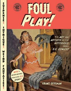
1) Foul Play!, by Grant Geissman. It's subtitled "The Art and Artists of the Notorious 1950s E.C. Comics," so if you know what that means, then you have a pretty good sesne of the book. If you don't, then you should know that E.C. Comics were reknowned for their beatiful artwork (and beautifully chilling stories), as well as causing a scandal leading to the Comics Code yada yada yada. Anyway, the artists of the E.C. era were some of the greatest illustrators who ever lived, and this book gives brief biographies on the creators and a sample story of each artist. My three favorites are Harvey Kurtzman (for his design and storytelling sense), Wally Wood (for his gorgeous figures and sold-looking gadgets and spacecraft), and Graham Ingels (for his eerie brush effects). I actually received this book for my birthday, but just had a chance to read it. It only whets my appetite for the upcoming E.C. Archive editions (which should be released this fall!).
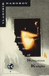
2) The Real Life of Sebastian Knight, by Vladimir Nabokov. This is another step on my journey to read all of Nabokov's work. I'm not doing them in chronological order because, frankly, I have read some of the earlier Russian novels (in translation) and I like them less than his English novels. So I'm jumping around. This one is a good one, but only if you've read some of his other works. Sebastian Knight is easy to summarize: it's about a narrator investigating his dead half-brother's life in an attempt to write a biography. But it's not really about that--that's just the narrative coat-hanger. It's about the nature of identity, and the imprecision of memory. It's about "literary movements" and Nabokov's disdain for them. It's about the fallacy of the biographic form. If that stuff sounds interesting, read it. If you're looking for a detective novel, this one won't be very satisfying.
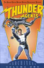
3) T.H.U.N.D.E.R. Agents Archive: Volume 1, by many talented artists (and some competent writers). Man, I love Archive editions. I have about 50 or 60 archive editions of various classic comic books, from The Atom to The Spirit to The X-Men (Marvel calls them "Masterworks," but they're the same basic format--glossy reprints in solid hardcovers). I picked up all SIX of these T.H.U.N.D.E.R. Agents Archives on ebay two weeks ago. I had never read any of the original stories--my only exposure to the characters (who, by the way, are basically Silver Age superheroes combined with a 60s spy setting) was from a 1980s revision done by some now-defunct publisher. But these original stories are as much fun as I had expected. The artwork is some of the best superhero art of the Silver Age, with work by Wally Wood (he did much more than just E.C. Comics), Gil Kane, Reed Crandall, and others. I can't wait to read the rest of the volumes.
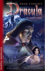
4) Dracula adapted by Gary Reed and Becky Cloonan. This is the Puffin Graphics comic book adaptation of the Stoker novel, and I bought it for the Cloonan art. She's one of my favorites out of the young crop of indie artists (although she's doing a lot of work for DC now, so she's gone mainstream), and she brings this moody story to life with flair. I have about five of these Puffin Graphics books now, and they are all pretty good. My only complaint is that sometimes the cheesy covers ruin the appeal. In this case, while Cloonan does the inside art, some airbrush cheeseball does the cover, and he makes it look like a straight-to-video movie version. Don't be fooled by the crappy cover. The art inside is MUCH BETTER.
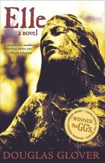
5) Elle, by Douglas Glover. I read this book a few weeks ago in preparation for a book discussion group I was asked to join. I've never been in such a group, and I often wondered what the point of such a group was. It's not like I need help understanding what I read, and it's not like my opinion about the book's going to change just because someone has a different opinion, and I don't really care about the characters and what they would do if...or what we would do if we were the characters...blah blah. I do that stuff all day as an English teacher anyway. I don't need to do it as an extra-curricular activity. But the group was excellent, because we talked largely about artistic choices and matters of craft, and the peeps in the group were all smart and funny. So--good times. The book, though, is not one of my favorites. I like Glover's style, on the sentence and paragraph level. I like his voice. But there's too much Native American mysticism and the novel, which starts with an amazing opening, eventually just becomes numbing (until a terrific ending, which is marred by a pointless epilogue). So, yes, Vivian Dorsel loooooooves it. I kinda like it. But I don't enthusiastically recommend it.
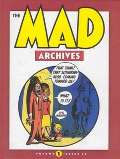
6) The Mad Archives: Volume 1, by the usual gang of idiots (before they were called that). I told you I loved Archive editions! And guess what? This one has artwork by, you guessed it, Wally Wood! Plus, it's full of good stuff. This volume reprints the first six issues of Mad back when it was a comic book and not a magazine. I'd seen some of this stuff before, but to read each issue cover to cover was a joy. This was a time when Mad was about telling funny stories and satirizing the comic book storytelling tropes--it wasn't about just cracking corny jokes, or parodying movies by just drawing goofy looking versions of the actors. This was the good stuff. Although, Howard Cruse tells me that the post-Kurtzman era, when it first became a magazine, is amazing as well, because they actually hired read comedians to write the satirical stuff. Nowadays, the magazine is just a shell of its former self. Does anyone even read it anymore?
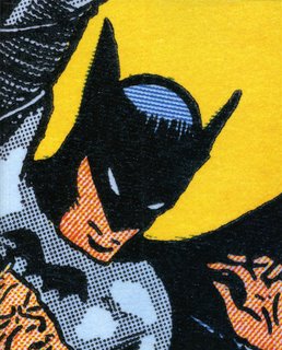
7) Batman: The Complete History, by Les Daniels. I've read the Superman volume, and I've read the Wonder Woman volume, both of which I enjoyed quite a bit. They are all designed by Chip Kidd, so they look great, and it was nice to see Daniels's overview of the comic books and the media appearances by these characters. The Batman volume, however, was disappointing. It's worth owning (so I can complete my set of the three, I guess), and I got it for free anyway, because my sister-in-law gave it to me (her boss gave it to her--they both work at Time-Warner HQ, and this copy was floating around the office apparently). It's just not very informative. Part of my problem with the book is that it doesn't seem to go into much detail about the interesting points of the Batman story (the much-disputed creation of the character, for example: Bob Kane got all the credit, but most sources now say that he did almost nothing on the series--a fact which Daniels glosses over quickly). Daniels does offer a comprehensive perspective, sure, but it's a bit too large-scale and doesn't provide much in the way of engaging anecdotes or critical perspective. Maybe the problem is that I know too much of this stuff already, whereas I knew a bit less about Superman and much less about Wonder Woman. But, hey, the book looks snazzy (and yes, that is the actual cover in its entirety).
Subscribe to:
Posts (Atom)