Wednesday, February 28, 2007

Mazzucchelli's Odyssey

David Mazzucchelli, of Batman: Year One, Daredevil, City of Glass, and Rubber Blanket fame, told me at the NYCC that he has a 300-page graphic novel scheduled for release in the fall. A "book publisher," he says, not a comic book publisher, will be releasing the graphic novel, but since the contracts haven't been signed, he can't officially announce the details. When I asked him about the story, he said, "oh, it's your normal tale. [pause] Of a man. [pause] Trying to return home. [pause] And having adventures along the way." He knew I was a teacher, because of what we'd been talking about earlier, and so I smiled and said, "sounds like a book I teach every year. [pause] To freshmen." And he just nodded.

So I guess we should be looking forward to Mazzucchelli's Odyssey sometime before Christmas. I would put it on my wish list, but, let's be honest, I won't be able to wait until Christmas. I'll be pre-ordering as soon as possible.

Sunday, February 25, 2007

New York Comic-Con 2007: Part Two

Saturday at the NYCC didn't start off as promising as Friday had. I was stuck waiting in line for an hour just to get inside, even with a Professional Badge. Only Exhibitors and Press got to cut right in. I should have just called the Sequart guys and had them bring me out an Exhibitor badge in retrospect. I'll have to keep that in mind for next year. But once I got inside it was all cool. Busy, but cool, especially because I had two old pals waiting for me on the convention floor. Erin and Chris, two of my former students, drove down to attend the show (and pick up copies of my book!) It was great to see them. I see Erin every once in a while because she tutors at Word Street, a local non-profit writing center that I help run, but she's always cool to hang out with. And I haven't seen Chris since he graduated. They both seemed to have a good time at the Con, even though they couldn't buy as much as they would have like with their limited funds. Hopefully, they'll be able to come down next year with a bigger pile of money so they can really go crazy.

One of the things I decided to do on Saturday was start a Legion sketchbook. I actually left a brand new sketchbook with Paul Azaceta, who was doing free sketches for anyone who bought the excellent Image book, Grounded. Paul was too swamped Friday evening to get anything drawn for me, so he hung onto it overnight and came back Saturday morning to find a two-page spread featuring Superboy in the foreground and a plethora of flying characters behind him. It was a great way to launch my new sketchbook, so thanks Paul! And to continue the Legion theme of the sketchbook, I patrolled Artist Alley looking for former Legion artists and found Joe Staton looking like he was ready to draw me something nice. I had to leave my sketchbook with him too, since he had a bit of a backlog, but I ended up with a nice Lightning Lad headshot from the man. It was cool to get a Bronze Age Legion artist to contribute the second sketch in the book.

Of course, I really wanted a Keith Giffen sketch too, but no matter how many times I stopped by his table, he was nowhere to be found. Next year, hopefully, I'll be able to corner him for a contribution.

Unwilling to wait in any long lines or pay more than a few bucks for a sketch, I stopped by Rick Veitch's booth, figuring that he might be cool enough to draw me a free sketch. He seemed willing, at first, until I mentioned that I'd like it to be a Legion of Super-Heroes character. He scoffed. He made faces of disgust. He waved his hands in protest. "No. God no. Ugh," he said. "Come on," I said, "you can do Chameleon Boy. He can transform into anything. So anything you want to draw you can just label 'Chameleon Boy.'" He still refused, but with less vehemence. Perhaps the sight of the single tear running down my cheek made him relent. Not really. But he did agree to do the sketch, mainly because he had a nefarious plan. He said, "Okay, I'll do a quick one. Does Chameleon Boy have any special markings or anything?" "Just antennae," I said. "If you put two antennae sticking out of anything, it would be Chameleon Boy." So I watched Rick Veitch as he drew his version of Chameleon Boy: three flies buzzing around a giant turd (complete with antennae). He wrote "Chameleon Boy" under the pile of feces, and signed his name beneath it. It's really the perfect Rick Veitch drawing. It succinctly captures his disdain for traditional superheroes. It made me laugh. It's quite a contrast to the Joe Staton Lightning Lad piece. And how many people in the world own a Rick Veitch Legion drawing?

Kevin Colden, brilliant young artist and book-cover illustrator, was the final contributor to my Legion sketchbook for the day. I gave him, at his request, some reference to use, since he's not a big superhero fan, and let him choose a character from a giant group shot of the assembled Legion. The source of the reference was a photocopy of a page from the Legion of Super-Heroes Sourcebook published by Mayfair Games. I copied the page for just this occassion, and because the book is from 1986, the image featured Supergirl with her classic headband look. Kevin was smitten by her elegant ensemble, and he drew me a full sketch of the 80s Supergirl as the fourth and final drawing in the book. He told me that it was his first EVER convention sketch. I'm proud to have been a part of that moment, because with Kevin's talent, it certainly won't be his last convention sketch.

Artist Alley was too jam-packed to move by that point in the day, so I returned to the floor of the convention and spent the rest of the day manning the Sequart booth, signing copies of the Grant Morrison books for happy customers, and picking up 50-cent copies of Legionaires issues that I was still missing from my collection. I got to hang out with Tom McLean, writer of the other new Sequart book, X-Men: The Movie Trilogy and the Comics for a couple of hours, which was cool, and hopefully I'll get to see him in San Diego if I ever make it out there. (Doubtful for this year, what with my 10th wedding anniversary coming up this summer, but next year I should be able to make the trip.) I also got to meet RAB from Estoreal who was a fan of my Morrison stuff. We mostly talked about Adam West, though. I'll be interested to see his review of my book when he gets a chance to read it. It was fun to meet my audience, because for most of last year, as I wrote the essays that became the book, I really felt like I was writing it for myself and maybe one other weird guy in the world. By the end of the convention, I realized that I had an audience at least TWICE that size. And if I double my audience every day for the next year, I think that would equal the poulation of the world. Or something.

By the end of Saturday, I was pretty exhausted. I didn't end up visiting a single panel, as it turned out, and that's something I'd like to remedy next time. The panels seemed pretty decent this year, and by all reports they were quite under-attended. But I did have a good time just hanging out with people, getting those few Legion sketches, and picking up some back issues.
I also got some cool things that I'll review at some point--The two newest issues of Action Philosophers for example, which has been a consistently fun read. I also picked up the first four issues of Pirates of Coney Island, a book I've been looking forward to since last summer, but was never able to track down. And, always a sucker for TwoMorrows books, I grabbed the two newest Modern Masters books (with Kevin Maguire and Charles Vess, respectively) and that copy of Best of the Legion Outpost that I've avoided buying for years (I needed it for a top secret project I'm working on, though--but don't worry, you guys will find out about that project soon!).

When Judy finally called to say that she was swinging uptown to pick me up (she'd been hanging out with her family, and our kids, in Little Italy all day), I was ready to go. I was comic-booked out. But still energized by the whole experience. All in all, I had a great time, even if I did have to wait out in the cold for a little while that morning. Can't wait for next year, when NYCC will be held in the much warmer month of April. Now I just have to get to work on my next book!

The Full New York Comic-Con Post: Part One

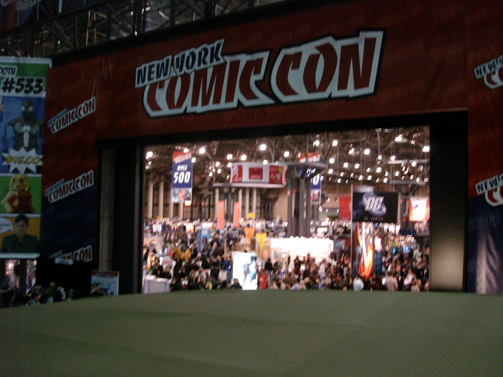
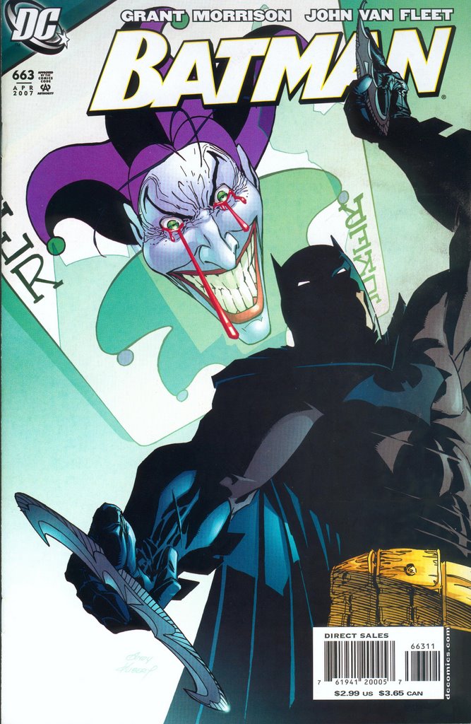
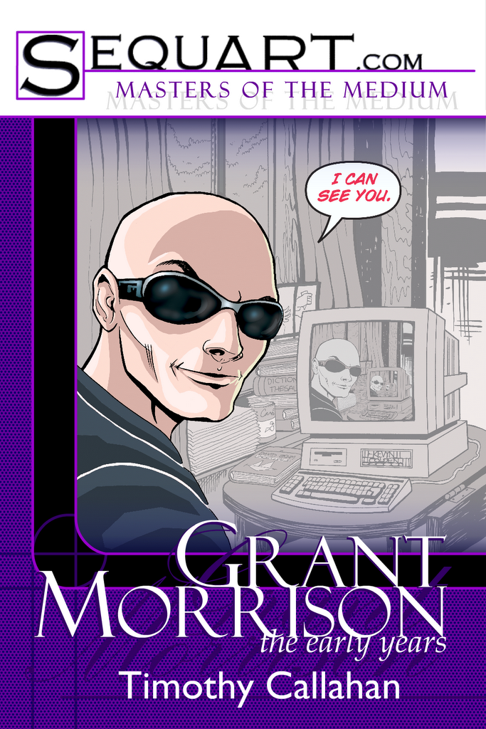
I had four reasons for going to the NYCC this year. (1) My Grant Morrison book was being launched; (2) I needed to look for some Legion of Super-Heroes comics so I could come closer to completing my collection of everything Legion; (3) I wanted to hang out with the cool people I've been working with for Sequart, most of whom I'd never met face-to-face; and (4) I loves me some comic books. Any one of those reasons would have compelled me to attend the show, but all four of those reasons combined into an unstoppable force. Even the pounding Nor'Easter of Friday morning couldn't stop me from making the three-hour drive to the city. (Okay, it wasn't that bad of a storm, but the roads were pretty dicey up here in the north, and so we only drove halfway before hopping on the Metro North.)

Since we only went down on crazy Saturday last year, I had no idea how casual Friday could be at the Con. It was nice being able to just aimlessly wander around and chat with people before the crowds arrived at 4:00. I should have been more active though, especially in Artists' Alley. I could have picked up a bunch of sketches when things were slow, but I wanted to scope everything out first, and, of course, by the time I did (at my leisurely pace) the place started getting busy and I missed my chance (or I would have had to wait in lines to talk to people, which I refused to do). I'll remember to make better use of Friday next year.

Judy and I did get to speak to Paul Levitz again this year for about five minutes. I had corresponded with him a few times over the past year regarding the Morrison book, and I showed him the final result. I mentioned that Judy was a Stuyvesant grad like he, and his response to me was, "You just bumped up a few notches now that I know you bagged a Stuyvesant girl!" Then we talked about Legion stuff for a while, reminiscing about some of the classic Hamilton/Forte stories when I brought up my son's interest in the new Legion cartoon. Paul said those classic Silver Age stories are perfect when you're six. Although, as we all know, those stories are perfect no matter how old you are, especially if you can appreciate the genius of Bizarro Computo. I mean, Bizarro-freakin-Computo! Come on! It just can't be beat.

We didn't do much buying during our first lap around the Con floor. I literally didn't buy anything, which shocked Judy, as she (a non-comics fan) out-spent me during the first few hours by purchasing $20 in First Second graphic novels. Of course, by the end of the night, I'd shelled out $150, but that's not too bad. I mostly picked up those Superboy and the Legion issues I was missing (pretty cheaply) and a few things like the Shazam! and Elongated Man Showcase volumes plus the two George Khoury Alan Moore books from TwoMorrows (his Kimota! book is out-of-print, and I hadn't been able to find it anywhere, even ebay, so I was glad to snag it for $10). Judy and I also filled about 5 large shopping bags with free stuff. Friday is a bonanza for free stuff, especially paperback books, as publishers are trying to get these preview copies into the hands of as many people as possible. We paid for it later, having to lug all that stuff around NYC, but who can resist mountains of free stuff? Not us!

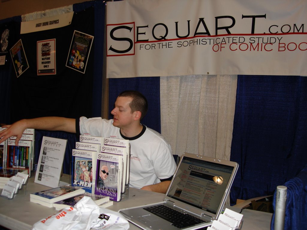
After all the getting and spending, we got to hang out with the Sequart peeps for a bit. Since Judy was with me, I didn't really want to sit at the table (plus, they only had one chair anyway, which they had to pay $45 to RENT for the weekend--how ridiculous is that?) and sign copies of my book--I knew I'd be able to do that Saturday.

But I did get to finally meet the brilliant artist Kevin Colden (here's a pic--that's me on the left and Kevin on the right, posing with what is probably the finest work of critical literature ever written). Kevin illustrated the cover of my book, and I'm more than pleased with how everything turned out. And, as you can imagine, he's a super-cool guy. I'm sure we'll work together again in the future, after he's done drawing me those 58 Legion of Super-Heroes sketches he promised (just kidding, Kevin. Or am I?). Anyway, Kevin's sure to become a big shot one of these days, so check out his work on Todt Hill over at The Chemistry Set.

After making some sweet man-love and talking about how awesome we all are, all of us Sequart guys posed for this photo (suitable for framing). From left-to-right, that's Marc Sobel (writer of the "Shelf Life" column), me, Kevin, Julian Darius (founder of Sequart.com), and Mike Phillips (editor-in-chief of Sequart.com). All of the people in this picture are geniuses, and if you were at the Con and you didn't stop by the table, you really missed the opportunity of a lifetime. I doubt you'll ever get a chance to redeem yourself. Unless you show up at NYCC next year. And visit the Sequart table. Which you should.

Later on, after the place became much busier, Judy and I spent some time hanging out at Artist's Alley. In other words, we waited until it was busy to hang out in the smallest, most cramped section of the Con. Turns out, that wasn't the best plan. Since it was a bit too crowded for us, we didn't stay up there (yes, Artists' Alley was not, in fact, an Alley, but an upstairs room), we just basically walked past everyone and only stopped at a few tables. Brian Bolland had a huge line, which caused a lot of congestion in the flow of traffic (and it didn't help that he was across from Neal Adams), so we didn't really stop to chat with anyone.

If I had more time, and more patience with lines and crowds, I would have stopped to talk to Jose Luis Garcia-Lopez (pictured here at his booth). I'm a huge fan of his work on two projects in particular: Atari Force, which I will someday write about here or at Sequart, I'm sure, because I love it! and Twilight, the deconstruction/reconstruction (Julian and I could discuss this all day) of the DC space heroes he drew based on Howard Chaykin's script. But, instead of stopping, I just got a quick pic.

I did stop to talk to, and buy a signed copy of Abraxas from, the great Rick Veitch. Veitch is a creator who has been as innovative and important to the medium as guys like Moore, Morrison, and Miller, but he has received none of the critical attention that the others have. I told Julian that I'd love to see someone do a critical book on Veitch, and he enthusiastically agreed. He said, in fact, that he would write the book, but he wanted to wait for the conclusion of the Heroica trilogy (which began with Bratpack and Maximortal) before writing about Veitch. I disagreed, because it doesn't look like Veitch is going to finish that trilogy anytime soon, and his body of work is amazingly substantial without it. I mean, this is a guy who has not only written and drawn the above-mentioned books, but he has also created The One, a powerful run on Swamp Thing and worked with Alan Moore on Miracleman, Supreme and Greyshirt among other things. This guy is clearly a major creative force in the medium, and he has been for 25 years. Anyway, Rick, if nobody writes a book about you by the time I finish my studies of Grant Morrison, you're going to be my next big project.

After talking to Rick, Judy and I said our goodbyes to the Sequart crew and headed home. As I mentioned in a previous post, getting all those heavy bags home was a pain, and it wasn't really worth it since we won't read 80% of the free books we received. Who has time when there are so many COMIC BOOKS to read!?!? (Especially those enticing ones written by Grant Morrison or featuring an entire LEGION of super-heroes--I mean, who can resist?)

When we finally arrived home and unloaded the stuff, the piles looked like this. These giant stacks depicted here are all things we got for free. You might be able to see one or two books on the far left and far right that we actually bought, but all the stuff in those towering piles in the middle were the give-aways. Now you can see why our bag ripped open and why the walk to the train station was less fun than it might have been. But, hey, free stuff! And that was the end of the first day.

Saturday, February 24, 2007

NYCC 2007--Tired and Sleepy

It's late. We just got home from the New York Comic-Con. I still need to do a few things before bed like a) get reference ready to bring tomorrow so the cool kids will be able to draw old-school Legion of Super-Heroes sketches for me and b) put away all the free swag that we scored today--or, if not put it away, at least move it from the huge pile in the middle of the living room so the kids don't trip over it and/or eat it when they wake up tomorrow (in the 10 minutes of free time they'll have before we drive back to NYC for another day of this comic book greatness). By the way, it's great getting 80 pounds of free stuff from exhibitors, but it sucks carrying it for a mile until you can finally hail a cab to bring you to Grand Central. We were so sick of carrying everything, we decided against the subway, even though we reached the entrance by the time we found a cab anyway. The cab ride was nice, though. No heavy bags to worry about.

Anyway, here's some pics of Day One, with a much more detailed report coming by the end of the weekend.


Comic-tastic! Now for some sleep. Soon-ish.

Tegneseriesiden, suckers!

I have no idea what any of the words mean, but I checked my sitemeter info tonight and saw that at least one person recently viewed my blog based on a link that came from this website: tegneseriesiden.dk

My blog is big in Denmark?

I think this means it is.

Thus I win another battle against David Hasselhoff in my everlasting war for dominance in continental Europe.

Sunday, February 18, 2007

Batman in Living Prose!

Batman #663 has already generated much commentary/consternation around the world with its prosaic depiction of the caped crusader. The posters at Barbelith seem to like it quite a bit, but at Newsarama, people on the message boards seem to find it perplexing because of the abundance of words and sentences instead of drawings, while Jog, from the famed "Jog--the Blog" sums up his critique in his opening line: "Oh shit. This wasn’t very good at all."

Because I'm going to be showing up at the NYCC as a Grant Morrison expert of some sort, what with my book and all, I feel like I should weigh in with my thoughts on the issue.

I think #663 is quite good, actually. It's quite different from what we've come to expect from the Batman title, and quite different from what Morrison has been doing lately. It's clearly a story which responds to Morrison's own Arkham Asylum, pays homage to a famous Batman story from the late 70's, and acknowledges Morrison's humble beginnings on the character from the days of the hardback DC annuals published in the UK. It does all that and rebuilds the Joker character for the 21st century in a swift and brutal manner. It's the ultimate in compressed storytelling--using prose as a violent strike against the slow-moving narratives of many current comic book stories (and having the issue appear after Ostrander and Mandrake's flaccid and laborious "Grotesk" serial, only accentuates the speed and power of Morrison's story.)

Now, let me go into some detail to prove all of this:

1) Batman #663, "The Clown at Midnight," is a response to Arkham Asylum. This is apparent in the issue's emphasis on the duality of Joker and the Batman, the setting (largely within the asylum itself), the use of the pattern motif (although it was fractals in Arkham and it's checkerboards in "The Clown at Midnight"), and the notion of the Joker's "super-sanity" which was established in Arkham as an explanation for his ever-shifting personality and used in "The Clown at Midnight" to establish the Joker's transformation into a force of terror. As Morrison writes in #663, "[The Joker's] remarkable coping mechanism, which saw him transform a personal nightmare of disfigurement into a baleful comedy and criminal infamy all those years ago -- happily chuckling to himself in the garage as he constructed outlandish Joker-Mobiles which gently mocked the young Batman's pretensions in the Satire Years before Camp, and New Homicidal, and all the other Jokers he's been--now struggles to process the raw, expressionistic art brutal of his latest surgical makeover." This Art Brutal stage, which is embodied by "The Clown at Midnight" (the title of the story is the very name of this new iteration of the Joker's persona), will provide a significantly more menacing nemesis for the Batman in the future. Morrison establishes this not only with the Joker's surgically altered appearance (with the sides of his hideous smile sewn shut by the butchers at Arkham), and not only with the Joker's crazed explanations, "'It's the oldest, bestest gag in the book,' the Joker spits and slurs, eager for the last laugh. 'Red and Black. Like a bat. In a dream. In a window," but with the symbolic sacrifice of Harley Quinn, a character who represents the more whimsical Joker that will be left behind on the stroke of midnight. Ritual and transformation are the centerpieces of this story, just as they are is in Arkham Asylum, only this time it's the other side of the mirror that's featured. It's about the Joker now. As the Joker helpfully points out, Batman is just in the story as a "straight man" for the Joker's absurdist comedy.

2) This issue is a departure from Morrison's recent work. With its collage narrative, ambitious themes, and heavy symbolism, it's much more in tune with the work Morrison produced in the late 80's / early 90's. Recently, as seen in his past few issues of Batman and his (quite wonderful) work on All-Star Superman, Morrison has shifted his narrative emphasis toward more traditional superheroics, revealing the mythic nature of these characters using Silver Age tropes. Even the high-wire act of Seven Soldiers was an attempt to explore different facets of superhumanity, providing an over-arching storyline as a structure for looking closely at different superhero traditions. "The Clown at Midnight" is definitely a return to the Arkham-era Morrison, at least for one issue, perhaps ritualistically, as a way of freeing himself from the past and providing a fresh start for his continued work on the title.

3) This issue pays homage to a famous Batman story from the late 70s. In DC Special Series #15, published in 1978, writer Denny O'Neil delivered a prose Batman story, entitled "Death Strikes at Midnight and Three," which featured illustrations by the young Marshall Rogers. The tale, reprinted in The Greatest Batman Stories Ever Told, is a hard-boiled, street-level crime tale, complete with prose of the purple variety: "His knees buckled," O'Neil writes, "and he collapsed quickly and awkwardly, as though all his joints had been severed at once. His head bounced on the sidewalk before Wayne could catch him." It's a story filled with Pulpy-goodness, but it's not actually very good as a Batman story. But Morrison channels some O'Neil in "The Clown at Midnight," certainly. Both titles share the word "Midnight," which probably isn't a coincidence (since both stories are clearly the two most prominent Batman prose stories ever published, Morrison must have been aware of O'Neil's title). Both stories take a similar pause in the narrative to wax poetically on Gotham City. O'Neil writes, about Gotham, "It is a monster sprawled along 25 miles of eastern seaboard, stirring and seething and ever-restless." Morrison writes, "Welcome to Gotham City, a party ten miles long and 6 miles wide...a 21st-century American Babylon has shouldered its way up from the mudflats and sauntered into the spotlights, eager to dazzle and seduce the world." Other than the description of Gotham, which is strangely in present tense, O'Neil uses past tense thoughout his narrative. Morrison, though, maintains the present tense in every line of his story, adding a shocking immediacy to the horrific events of the tale. And other differences exist, obviously, since Morrison is paying homage to an earlier work, not providing a re-telling, but "The Clown at Midnight," doesn't seem likely without O'Neil's precursor, even though...

4) Morrison is also paying tribute to his own humble beginnings as a writer of prose stories for UK annuals. Two years before he published Animal Man and Arkham Asylum with DC Comics, he contributed a prose story entitled “The Stalking” to the 1986 Batman Annual published in England. The story, a three-page narrative with illustrations by Gary Leach, describes Catwoman’s excursion into the Batcave as she attempts to uncover Batman’s secret identity. It’s a fun story in which Catwoman discovers that the dinosaur in the Batcave is actually a giant robot, and she uses it to fight Batman before rushing upstairs to find out who lives above the underground base of operations for such a crimefighter. She gets knocked out before uncovering Batman’s secret, and that’s the end of the story. Unlike “The Clown at Midnight,” “The Stalking” is written in the past tense, and Morrison’s prose was much looser and less evocative in his early career. Compare a pedestrian sentence from “The Stalking”: “The hatch opened and Catwoman jumped down, landing on her feet,” with a more vigorous sentence from a similar point in “The Clown at Midnight”: “She runs to him across the tiles, suddenly uncoordinated and awkward, flushed with hormones and neurological seizures.” Both of those sentences are pretty typical of the type of sentences you’ll find in each story, and they illustrate how much Morrison’s prose has improved over the years. Perhaps “The Clown at Midnight” is an attempt to redeem himself. (Even though I’ve never talked to anyone who’s actually read Morrison’s early prose work from the UK annuals except for the Barbelith crowd.)

5) It’s the ultimate in compressed storytelling. Had Morrison chose to tell the story of the Joker’s transformation using sequential art instead of prose, he would have had to spend several issues at least. The elimination of his henchmen, Batman’s search for clues, the Joker’s “recovery” in Arkham, the confrontation with Harley Quinn, and the final showdown all would have taken pages and pages to tell. It’s a full four-issue story arc compressed into a single, powerful issue. That, alone, is enough to recommend it in the days after we spent half a year watching the painfully slow “Grotesk” storyline unfold. Had “Grotesk” been told as prose, it would have taken two sentences. “Her brother was horribly disfigured. Now he’s mad.”

We should all just be grateful that Morrison’s back on the title, but on it’s own merits, Batman #663 is an excellent story, well-told, with plenty of allusions to Morrison’s history with the character. It is an essential part of the Morrison canon, but I’m sure, like Arkham Asylum, it will be underappreciated for years to come.

Friday, February 16, 2007

Grant Morrison: The Early Years

One year ago, as mentioned in one of my very first blog posts ever, I ventured to the New York Comic-Con and spent a few minutes talking to the guys from Sequart.com. Next week, after a year of scholarly study, monastic discipline, and napping, my book-length study of Grant Morrison, now entitled Grant Morrison: The Early Years, published by Sequart Books, will premiere at the 2007 New York Comic-Con. As far as I know, this is what the cover will look like. We went back and forth on the image (Grant's wife didn't like the likeness at first, but artist extraordinaire Kevin Colden cleaned it up, adjusted the colors, fixed Grant's nose, and produced the masterpiece you see here today), and I objected to the original color of the frame, which was a harsh purple, but we worked everything out and agreed on this design. I'm very pleased with how the book looks, and the contents should be equally impressive. After all, I wrote it. And it's got like 200 footnotes. You know how I love footnotes. If you don't, then I'll tell you: I love footnotes. A lot. They are the best notes around. Far, far better than endnotes. And if there are any other notes around that I don't know about, I'm sure footnotes kick their asses as well.

So if you're in New York City next weekend, stop by the Sequart booth at the Comic-Con. Buy multiple copies of this book, because it's a LIMITED EDITION. It won't be available to the public until March. If you can't get to the Comic-Con next week, you'll have to wait until then to purchase it at Amazon. Seriously, though. It will be worth the drive to New York. I mean, it's a book. It's got a cool cover. It's got hundreds of pages written by me, and did I mention the footnotes?

Lyla Grace Has Superpowers


Because my pal Frank Tempone finally updated his blog, I owe it to the world to do the same. Plus, next week will be a big week for me (yeah, New York Comic-Con where my GRANT MORRISON BOOK WILL LAUNCH), and I will be using this blog to keep all of the new fans up-to-date. So, if you're one of my new fans...hey, what's up?

Anyway, back to this post.

"Lyla Grace Has Superpowers," as mentioned a month or so ago, and as pictured above in her very first sketchbook appearance, will be part of my Bag of Glass Comics anthology that will probably never happen because I'm so busy, but you never know. I'm bound to do something with Lyla and her precocious turtle one of these days. I like the sketch. I think the character has potential. I drew Lyla a year and a half ago (as you can see by the date), and came up with her supporting cast right away. It's your basic fish-out-of-water-coming-of-age-superpowers-as-symbolic-wish-fulfillment-heroic-quest-existential-docu-drama, but in high school. With energy blasts. And teachers who wear luchador masks.

It's badass stuff, obviously. Oh, and if you were wondering, Lyla's pants were inspired by my purchase and subsequent viewing of Gatchaman Volumes 1 +2 in the summer of '05. Jinpei (aka Keyop) wears some pants like that, and since he's a Science Ninja, he obviously has mad style. I couldn't find a pic of him with the stripey pants, but you can see in the image below that he has crazy Science Ninja fashion skillz:


Ah, Jinpei. You know, I watched Gatchaman every day after school back in the 70's when is was edited for American consumption and broadcast as Battle of the Planets, and I only saw it in color once (at a friend's house) until I got those dvds. We actually had a black-and-white television until the late 70s. I can pinpoint the exact year we got a color television, by the way. It was 1978, and I remember only because I was watching Battlestar Galactica in black and white during a thunderstorm and the antenna on our roof was struck by lightning, killing that television. We went shopping for a color television the next day. Fascinating. Now, of course, I won't stand for anything less than 57" of HD television. If I had watched Battle of the Planets and Battlestar Galactica in 57" HD as a child my head would probably have melted due to awesomeness, though.

Maybe not.

Back to Lyla Grace! I also sketched some of the supporting cast, like her older sis, who goes by the stage name MK Ultra, and her sis's crony, Skazz:


If you want to see more of Lyla Grace, keep bugging me. I will cave in to peer pressure. Because although I'd love to do a 100-page graphic novel detailing Lyla's first romance and/or battle with Extra-dimensional Viking Nazis, I'm lazy. But I do respond well to taunting and offers of cash prizes.

Monday, January 01, 2007

BAG OF GLASS COMICS

In honor of the new year, I'd like to formally announce an upcoming project! I don't know when it will be released, and I don't know how many awesomely unbelievable pages it will contain, but BAG OF GLASS COMICS, an amazing anthology of full of graphic narrative goodness, will hit the shelves in 2007. Pre-order yours today!

In addition to returning favorites like "Theosophist," "Arcadia Estates," and the always-unforgettable "Ninja Wolf and Squidhunter," you'll also reckon with the likes of "Teenage Assassin," "Pathogen 2099," "SCUKA [Self-Contained Killing Apparatus], "G.O.D. Force One," "Baby vs. Playstation Returns," "Hero Squadron of Yesteryear," and "Lyla Grace Has Superpowers," in the amazing, once-in-a-lifetime BAG OF GLASS COMICS.

You can't wait, can you?

Wednesday, December 20, 2006

Deleted Scenes: The Grant Morrison Interview

So, for my MASTER OF THE MEDIUM: GRANT MORRISON book, launching at the New York Comic-Con (see you there?), I called Grant and did a one-hour interview. The meat of the interview will be published in that book, but as the conversation drew to a close, I talked to him about a few things that aren't relevant to the contents of the book.

Here you have it--the exclusive outtakes from the exclusive Grant Morrison interview conducted, I don't know, a week ago last Sunday, I think:

Me: Besides the work I cover in the book, what stuff do you think is the most fertile for this type of in-depth analysis?

Grant: Whatever. I’ll leave it to you [laughter]. It kind of breaks into distinct phases for me. The stuff we’ve been talking about in this book was done when I’d been living with the same girl for nine years. I was really straightedge, I was, like I say, a boy in a band. But I was a really weird boy [laughter]. I was a really weird fucking mod, straightedge--didn’t take part in drugs, anything, you know? And then I got to 32 and just ran away from it after Doom Patrol. Went out there in the world and did all these things I’d never done before, so out of that period you see things like Flex Mentallo and The Invisibles, which are a lot more autobiographical and a lot more psychedelic. Because, at the time, that’s how things were going.

Me: What was after that? Do you think the JLA stuff was a distinct phase?

Grant: No, JLA was done...the whole psychedelic period laster for all of the 90s, basically. All those JLAs were written on drugs [laughter]. You can see the crossover with themes from The Invisibles. So that was the period--because it was a real psychedelic period--it was my Sgt. Pepper time, you know? That kind of stuff fascinated me, because it does seem to be at the center of which a lot of the other stuff revolves around. The Invisibles and Flex Mentallo. Then from 2000 on, there’s things, the Marvel stuff like New X-Men, and the Filth, which were really a different type of head. That’s me trying to deal with a really different world--a much harsher, unpleasant world after 9/11.

In any of these things there’s a lot of interest and underlying stuff, but I’m sure most people would be interested about The Invisibles and Flex. It was a kind of day-glow period.

Me: It really seems like you hit the mainstream once you started doing The Invisibles. That was the thing that impacted the widest amount of people.

Grant: Well, that’s the one that suddenly--I became friends with all sorts of people, you know, scientists and counter-culture people. My life actually became like the comic. It really overlapped [laughter]. Apart from the violence--but everything else--I shaved my head to look like the character, I went to kung-fu lessons. Every time the characters were in a different location, I would travel to that location, and things would happen and feed into the book and vice versa.

Me: So what’s next? What do you have on the agenda?

Grant: A bunch of new creator stuff. I’m kind of finishing up the last few years of intensive DC Universe things, and I’ll keep doing Batman for a while, I think, because I’m enjoying that. Superman will soon be finished. I’m really pleased with that one as well, but I kind of want to get on and do my own stuff again. So I’ve got four or five projects out from Vertigo next year.

We’re getting a lot more interest in movies, as well. After the We3 screenplay which I wrote. Suddenly, I’m getting lots of offers from everywhere [laughter]. All this kind of interest.

Me: Are they looking to adapt something, or are they looking for original projects?

Grant: No, basically, they liked We3. Everyone really liked the We3 screenplay, which was good news for me. People have just been coming to me with all kinds of things: Sherlock Holmes and all kinds of projects.

Tuesday, September 26, 2006

Katmandu

Here's a piece I did last year in my sketchbook based on an image from some magazine--Harper's probably. I was just playing around with geometric shapes and brushwork here, and I like the way it turned out, though when I erased the pencil lines everything smudged and blurred. Which adds a bit of humanity to the image, I guess. I tend to prefer things a little more polished and cold, and that makes a lot of my drawings lifeless, so I've tried to make an effort over recent years to loosen things up, mostly by using brushes to keep me from being to conservative with my line.

I'm going to be posting a bunch of sketchbook pages in the coming weeks, all of which come from the past two years. I've filled up 2 1/2 sketchbooks since then, but for the first three decades of my life I never kept a sketchbook at all. Instead, my doodles and illustrations were always done on random sheets of paper that I may or may not have thrown away.

It's nice to actually have my recent stuff bound together in these sketchbooks, though. I really should have started the process much earlier. That's my sage advice for the day: start a sketchbook, fill it up, then start a new one. It's fun for the whole family!

Saturday, September 16, 2006

Gotham City

When I was in college, Wizard magazine (which I actually read back in those days, before the interweb), in cooperation with DC Comics, ran some kind of Batman try-out contest. The winner would get something cool--like maybe publication or something. Anyway, you had to draw this Batman sequence that they gave you the script for. The first panel described a moonlit Gotham City, and then the other panels went on to describe the Batman swooping down and I think maybe Man-Bat was in the sequence? I really don't remember the details. It was during the time of the Azrael Batman, by the way, so his costume was all Robocoppy, which definitely detracted from any kind of moody effect I wanted to achieve.

Because of this, or because I never finished anything I started back then (see Mr. Potato Head for details), I only drew the first panel for the contest. This is the result:

I wanted to amp up the gothic imagery in the cityscape, and what could be more gothic than Notre Dame cathedral? So I plopped it right down in the foreground and left the more modern buildings in the middle ground. I like how it turned out. It's certainly the most detailed architectural rendering I've ever done, and although I'm not happy with the old-school cape effect up top (looks more like Bob Kane than even I intended), or the way the right corner of the cathedral lines up with the front corner of the Natural History Museum (the cathedral should extend a bit further to the right), I think it's a cool image.

I mean, it's Gotham City! Right?

Although if I had to do it again, I'd definitely put some kind of giant dinosaur skeleton on the roof of the Natural History Museum. Nah, that would be dumb.

Friday, September 15, 2006

Recommended: The Left Bank Gang

Last week I read Jason's new graphic novel, The Left Bank Gang. This Fantagraphics edition needs more effective glue (my binding has already cracked and the cover is nearly coming off), but the book is full of quality. I've never read any of Jason's longer work before--just some short pieces here and there. I was put off by his anthropomorphic animals and his seemingly expressionless style. I was wrong to dismiss him before.

This book, which tells an alternate-reality tale of Hemingway, Fitzgerald, Joyce, and Pound's self-imposed exile in France. In this version, the four are cartoonists and, running short on funds, they decide to pull a heist. After that point, the story turns into an homage of Kubrick's The Killing, complete with non-linear storytelling.

Honestly, though, the heist is only the very last part of the book. The first 2/3rds deals with the frustrations of the characters, and the naturalistic but oblique dialogue works perfectly to capture the feel of that lost generation.

It's a short book, only 64 pages, and the Kubrick homage may be a bit too faithful to the source, but it's an excellent read with clean, expressive art by Jason. I was wrong about his work before; he's a wonderfully expressive artist. I highly recommend this book to you.

Tuesday, September 12, 2006

Ninja Wolf in Space


In 2005, I self-published four issues of Ninja Wolf along with some other sweet minicomics. (They're all still available for a buck apiece, so if you're interested, send me an email.)

Anyway, this illustration is NOT featured in any of the Ninja Wolf issues. It was done on an oversized art board just for fun, and once I started drawing it, I knew that "Ninja Wolf in Space" had to be the title (and plot) of the first Ninja Wolf movie. So think of this as a teaser for such a film, coming your way no later than 2026.

Comic Book Scorecard: Week of 9/06/06

This week was lighter than last week, both in terms of quantity and quality. Here we go:

Uncanny X-Men #478, by Brubaker and Tan. I've seldom liked the X-Men. I enjoyed the Claremont/Cockrum/Byrne run. I loved the Morrison, Quitely, etc. run. I respect the Whedon, Cassaday work on Astonishing. I thought the second movie was pretty good. That's about it for me and the X-Men. I own a lot of X-Men comic books, but most of them are weak, incomprehensible, or dull. This new 12-part series by Brubaker and Tan is still too early to judge, honestly. Issue #478 is part 4 of the series, true, but that's still really just the beginning of Act II--I know the storyline is headed toward some huge battle between Vulcan, The X-Men, and the Shi'ar Superguardians, but it's a bit slow getting there. I like that it deals with the Shi'ar. I like that it's not mutant angst. I like that it's better than most X-Men stories already. But I hope Brubaker can pull it all together into something great. Grade: B-

52 Week Eighteen, by the usual peeps. I have been reading Shadowpact and the continuity between this series and that series has completely baffled me. Wasn't the Shadowpact team trapped in that city withing a bubble for the entire year. The same year 52 is supposed to take place? I thought so. Am I wrong about that? Then why are Shadowpact members appearing in this series all of a sudden? Will someone please help me out here? Anyway, I liked this issue, otherwise, mostly because it dealt heavily with Dr. Fate's helmet. I think Dr. Fate is one of the best, most underused characters in the DC Universe, and it's mostly because his helmet is so damn cool. Seriously, his helmet is enough to make me enjoy a comic book. That's more than a little weird, right? Grade: B

Atom #3, by Simone and Byrne. Ugh, I still HATE the "footnotes" that Simone throws in every once in a while. I think the footnotes are her awful attempt at metafiction and/or humor, but they just don't work. They are distracting, uninteresting, and unfunny. I actually emailed her after the first issue to beg her to please get rid of the horrible, horrible footnotes, and she said in her reply that she's going to continue using them, but use them less. She's just being stubborn. I'll bet you that by issue #10 the footnotes will be long gone. They are so very bad. Meanwhile, the story is not too shabby, and Byrne's art looks pretty good in this issue. We have a Lovecraftian monster, a new Giganta (is she the same Giganta from other DC comics? I have no idea), and a new villain who is a shrinking assassin called Dwarfstar. If a shrinking assassin named Dwarfstar sounds cool to you, then you are smart, because it is WICKED cool. Grade: B+ (would be an A- if not for those footnotes!)

Mystery in Space #1, by Starlin and Davis. I liked the Shane Davis artwork a lot more than I thought I would. I'm pretty much a clean-line type of guy, and the 90s Image look doesn't sit well with me. Yet, this week I bought a couple of titles that used that style quite effectively. It's too early to judge the overall storyline, but the first issue rejuvenates the old Captain Comet character and updates him TO THE EXTREME. That's actually not a joke. That's what really happens. But, still, I like swashbuckling space adventures, and Starlin is known for that sort of thing (I miss Dreadstar, don't you?). The back-up story, "The Weird," seemed just kind of pointless, though. And I always thought Starlin's "Weird" costume design was way off--he's supposed to be this alien being of immense power, yet he looks like a circus performer with a stylized ninja costume. That IS weird. Grade for the Captain Comet section: B; Grade for The Weird: D

Detective Comics #823, by Dini and Benitez. This is the other comic I bought that had 90s Image art, but yet I liked the style quite a bit. It's like Todd McFarlane had a love child with Bart Sears and Art Adams was the godfather. If that makes any sense to you, it probably doesn't sound like a pleasant sight, but it is. It works here. I particularly like the look of Batman in this story. It's a good look. Trust me. The Dini story is decent, but not brilliant. I like the savage portrayal of Poison Ivy, but the "villain," the Harvest, is not great. The ending implies that the ridiculous Harvest will inevitably return someday. I hope not. Really. Grade: B

Marvel Team-Up #24, by Kirkman and Kuhn. I have probably told you this before, but Robert Kirkman is the best old-fashioned superhero writer working today. He's not a fancy genius like Morrison or anything, but in the classic Stan Lee mode, or Claremont mode, or whatever old-school writer you like, you get Robert Kirkman. He just tells a good story and seems to have fun doing it. That's why I like this series, and I'm sad that it's ending next issue. But the story he tells this week is a great one, with the final battle between Freedom Ring and Iron Maniac (see--look at those names, they are absurd, but Kirkman doesn't care--he doesn't justify them--he knows he's writing a comic book and he just goes for it). You know what, I just like that there's a crazy alternate reality Tony Stark running around calling himself Iron Maniac. That's enough to make me happy. The excellent narrative is just icing. Grade: A

Y the Last Man #49, by Vaughan and Guerra. Yorick's quest seems to have hit a bit of a lull here. There aren't any interesting action sequences here, nor any shocking revelations, nor any charming dialogue. I think the problem is that Yorick himself doesn't seem to know what his next step will be. Since issue #1, he's been looking for his girlfriend, but now he seems puzzled about what to do next. So maybe the issue simulates his lack of direction. Either that or it's just a weak issue. I just hope that Vaughan recovers and gets us on track quickly for the series conclusion (issue #60?). Grade: C-

Agents of Atlas #2, by Parker and Kirk. Jeff Parker is coming on strong. He's making a mainstream splash on this series and his work on the Marvel Adventures: Avengers title (which I haven't read, but I've heard good things about). Agents of Atlas, though, is looking good so far. I like the premise (the actual pre-Marvel heroes reuniting in the present day to fight their old nemesis--the racist characature of evil known as Yellow Claw), and I like the characters, and I like the pace of the story. The artwork is pleasant too. Good stuff all around. Grade: A-

Battler Briton #3, by Ennis and Wilson. This is another series I'm not going to read until I get a whole bunch of issues, largely because I have no frame of reference on these old British characters, and I need to sink my teeth into a pile of the comics before I get my bearings. Grade: Incomplete

That's it for this week!

Monday, September 11, 2006

United 93


I understand the concept of catharsis, but I rarely experience it. I look at art, whether it be paintings, fiction, or movies, from an intellectual perspective. I appreciate and enjoy style and technique. I savor the moment when an artist tries something new and creates innovation. I love things on an aesthetic level. But I'm rarely moved. Emotion doesn't tend to factor into my appreciation of works of art.

United 93 is an amazing exception. This film is a work of art which not only bowled me over with its handheld aesthetic, but it also provided an emotional catharsis that I can't remember experiencing before in my life. If you asked me today about my favorite movies of all time, this one would near the top, because I can't think of many more perfect blendings of intellectual and emotional pleasure. Pleasure's the wrong word, of course, because this movie is brutal and painful. But to watch such a masterful film, even one that tears you apart as you watch it, is a pleasure of a sort. It's horrible but beautiful, and it's not beautiful in the way that most movies are beautiful--it's not bright and pretty and colorful--it's beautiful in the sense that it perfectly recreates a time and a place that we need to revisit.

The movie is surprisingly devoid of political sentiment even though, contrary to what I've read about the movie, it doesn't take place entirely within the confines of United Flight 93. In fact, the movie jumps from location to location, providing a context about what we knew and what we didn't know on this terrible day five years ago. The contextual information is part of the catharsis. We need to see that second plane strike the World Trade Center, even if we don't want to, if the full impact of the events is to be felt (not only by us, but by the characters in the movie).

(Future generations will watch this movie, and they will not feel the devastation we feel when we see that plane hit the tower--it crushes us because we experienced that day--when we see the image, we recall the feelings we had when we first heard and saw what had occurred--our children will not have that context--so I wonder what they will make of this film. Will they see it purely in intellectual terms, as I usually do when I watch movies, or is the film good enough to provide catharsis to someone born after the events of that day? I don't know, but I suspect the greatness of this movie will not last. It will become just another movie about a historical event when our children are old enough to watch it.)

United 93 has no stars and no main characters. It is not a conventional narrative. Yet it is a movie that everyone should see because of its power and truth (and I don't mean literal truth, although it apparently is based on the facts that could be pieced together--I mean emotional truth). Watch it at night, though, because you won't be very useful for the rest of the day.

Sunday, September 10, 2006

Hey, Football!


In honor of the start of a new football season, I'm tossing out a treat from my old pile o' art. Here's Michigan Heisman Trophy Winner Desmond Howard as drawn by me all the way back in 1991. My brother was always a huge Michigan Wolverines fan, and this iconic image of Howard, copied from some issue of Sports Illustrated I'm sure, has always been one of my personal favorite football images ever. I love how this illustration turned out, which explains why I still have this piece in my possession and my brother has nothing. Ha, ha, sucker, too bad for you!

Maybe I'll draw a new picture for my brother's next birthday. A picture of Brian Urlacher fighting an army of ninjas! It could be like the awesome football fight in Flash Gordon! Ah, football. Good times.

Saturday, September 09, 2006

On Steve Yeowell

When I expand my Sequart.com Grant Morrison columns into a book, I'm going to add brief sidebar essays on the major artists Morrison collaborated with on the various comic book series and graphic novels. Although the focus of the book is a writer, I can't ignore the visual side of the stories. That would be ridiculous. So I'm going to post my thoughts on these artists on this blog from time to time to get ready for the book (which was supposed to be ready in time for Comic-Con New York, but that's not very realistic--summer 2007 is more likely). So here we go:

SPOTLIGHT ON STEVE YEOWELL

After working as a fill-in artist on the Zoids strip Grant Morrison was writing, Steve Yeowell soon joined Morrison to launch the pop music "superhero" strip Zenith in the weekly 2000 AD magazine. Yeowell was the only artist to work on Zenith through all four phases of the story, and Morrison was obviously pleased with the look of the series because he launched four more comic book series with Yeowell as his artistic collaborator: The New Adventures of Hitler (1990), Sebastian O (1993), The Invisibles (1994), and Skrull Kill Krew (1995). In addition, Yeowell worked as a fill-in artist during Morrison's Doom Patrol run.

The appeal of Yeowell's artwork lies in his ability to ground extraordinary characters by placing them in a solid context. He tends not to use extreme angles or dynamic perspective to tell the stories, but rather, he uses clean pen lines and solid blacks to give bold form to the proceedings. This is a particularly effective technique when working with Grant Morrison, since Morrison's scripts are full of fantastic invention and hallucinogenic narrative sequences. Yeowell's artwork adds a realistic context for Morrison's outrageous stories.

Consider this panel from Zenith: Phase 3:


The dialogue speaks of alternate dimensions and yet the poses are static and firm. There's no wild gesticulation on the part of Zenith or Robot Archie. And the background is not overly detailed--it doesn't distract from the foreground characters. In fact, Yeowell provides no background at all, save a bold black triangle around a white circle which gives a bit of graphic impact and compresses the frame to emphasize the main figures. The only dynamic aspect of the panel is the facial expression of Zenith's agent, Eddie, who looks at Robot Archie, from his position in the middle ground, with a look of complete shock. His expression underscores the dramatic nature of Archie's revelation, but because it is constrained to a relatively small space in the middle ground, his emotion doesn't overwhelm the panel.

In Zenith: Phase Four, he was granted the use of color, and although his pen and ink technique has changed, his panel compositions remain boldly understated:


Yeowell doesn't fill the panel with needless crosshatching or distracting details. Even the background, which he's actually drawn this time, is composed of simple geometric shapes which provide the illusion of dimensionality without drawing attention away from Zenith's face. Yeowell once again uses a solid black geometric shape (around the rear window) to frame the foreground figure, and the figure itself is posed naturalistically. The "camera angle" from which the scene is shown is nearly identical to the example above. The reader sees the image not from some absurdly dramatic perspective, but instead, the figures are seen head-on, and we are looking at them at about shoulder or chest level, giving them a slight appearance of superiority, but none of this is highly exaggerated. It's subtle and effective and tells the story with clarity and grace.

Even in the insane context of theDoom Patrol series, Yeowell provides clear storytelling and figures who are grounded in a simplified, but effectively rendered, reality:


His depiction of the Men from N.O.W.H.E.R.E. gave them a solidity that other artists weren't quite able to duplicate. Most other artists would obsess over the details of the costumes, distracting the reader with obsessively rendered chain-and-pocket-watch-belts, or overly ornate helmets. Yeowell suggests such detail but doesn't distract us with hundreds of tiny lines--instead, he uses blacks and negative space to add depth and texture. On this page, the lack of background information not only emphasizes the figures, but it provides a sense of disorientation for the characters as well. Flex Mentallo, in the right panel, is literally un-grounded. He is lost, emotionally, intellectually, and physically as he floats in the empty space provided by Yeowell. Notice also that the camera angle is again very similar to the two examples from the Zenith panels. We are slightly below the threatening Men from N.O.W.H.E.R.E, and slightly above Flex Mentallo and company, but not by much. In neither case are the figures shown from some extremely distorted or dynamic angle.

Steve Yeowell is the antithesis of the Jack Kirby model of comic book storytelling and the Image tradition of extreme rendering. That's why I personally disliked Yeowell's work when I first saw it as a teenager. It was so different, so apparently flat, from what I was used to seeing. But that's also why I enjoy his work so much now. I think Yeowell is one of the most interesting and effective artists working in the comic book medium, and I've only been able to appreciate his contributions now that I've matured enough to recognize his glorious subtlety.

Friday, September 08, 2006

Frank Miller and I

In addition to my ungodly love for any archive editions, I can't resist the higher-end Absolute Editions published by DC either. These things are massive, oversizes hardcover editions of the greatest works in recent comic book history, and they come complete with extra pages of commentary, or artwork, or whatever they decide would be cool. I have several of these suckers so far, and with so many new ones being released over the next year or so, I'm doomed to poverty.

The most recent one, by the way, is the Absolute Dark Knight. My recent posts may lead you to believe that I loves me some Batman. That's not exactly true. I actually prefer Superman. In fact, if I had to rank superheroes (which is stupid for me to even think about, because I buy comic books for the creators, rather than the characters), I would place Green Lantern and Flash even above Superman. So I'm not a big Batman guy. But I do love Frank Miller, so I couldn't resist this giant book, which collects The Dark Knight Returns along with The Dark Knight Strikes Again and some other supplemental sketches and original proposals, etc. I haven't actually read this volume yet, so I'll hold off on commenting upon it in more detail. I've read the stories several times in earlier printings, but it's been years since I've revisited either, so I'll let you know if my previous opinion still holds up. (For the record: my previous opinion would be that Dark Knight Returns is savage and brutal and shockingly good and Dark Knight Strikes Again is sloppy but still excellent--and I've always thought the negative criticism it received was due to expectations that were unrealistically high and inconsistent shipping dates when it was first released. But we'll see if that opinion holds.)

The point of this post is that I've always loved the stark, blocky, boldness of Frank Miller's style, and in going through my older artwork, I found an early tribute to his work. I thought this was interesting because it actually shows a bit of my process, and it shows how pathetically unoriginal I was back in those days (as opposed to today, when I'm expertly unoriginal). Here's the rough sketch I drew over a dozen years ago:

It's clearly based on Miller's Ronin, which is the story a science-fiction samurai. I might not have recognized the sketch as a Miller homage, though, if it wasn't accompanied by my finished piece:

Now this looks good, right? Except it's TOTALLY copied from a Miller illustration. But you can see that I at least improved my plagiarism between the sketch and the final, inked drawing. I can't remember exactly what I was thinking at the time, but I knew I thought of this as a "study" of Miller's drawing style, and for some reason I got the scale completely wrong when I did that first sketch. Anyway, I still love Frank Miller, but I don't copy his work anymore. Maybe I should. Maybe it would help. And, by the way, I also found other examples of times I "swiped" a pose or a design from another artist, and I will be posting them someday. For now, though, marvel at the awesomeness that is Frank Miller, as interpreted by me.

The Callahan Gallery--Bob Kane's Batman


I was reading the "Dark Knight Archives Volume 1" (which reprints the very first four issues of the "Batman" comic book) a few months ago, and I came across a panel where Batman's flying a plane, gunning down the bad guys. You just don't see that much anymore. So I was inspired to to a color illustration based on the panel design. It's not my best work, but I had fun slapping some watercolors on a piece of paper. The words Batman says, by the way, are exactly what he says in that early story. It's my tribute to Bob Kane, Bill Finger, and the great Jerry Robinson.