SPOTLIGHT ON STEVE YEOWELL
After working as a fill-in artist on the Zoids strip Grant Morrison was writing, Steve Yeowell soon joined Morrison to launch the pop music "superhero" strip Zenith in the weekly 2000 AD magazine. Yeowell was the only artist to work on Zenith through all four phases of the story, and Morrison was obviously pleased with the look of the series because he launched four more comic book series with Yeowell as his artistic collaborator: The New Adventures of Hitler (1990), Sebastian O (1993), The Invisibles (1994), and Skrull Kill Krew (1995). In addition, Yeowell worked as a fill-in artist during Morrison's Doom Patrol run.
The appeal of Yeowell's artwork lies in his ability to ground extraordinary characters by placing them in a solid context. He tends not to use extreme angles or dynamic perspective to tell the stories, but rather, he uses clean pen lines and solid blacks to give bold form to the proceedings. This is a particularly effective technique when working with Grant Morrison, since Morrison's scripts are full of fantastic invention and hallucinogenic narrative sequences. Yeowell's artwork adds a realistic context for Morrison's outrageous stories.
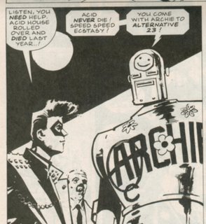
Consider this panel from Zenith: Phase 3:

The dialogue speaks of alternate dimensions and yet the poses are static and firm. There's no wild gesticulation on the part of Zenith or Robot Archie. And the background is not overly detailed--it doesn't distract from the foreground characters. In fact, Yeowell provides no background at all, save a bold black triangle around a white circle which gives a bit of graphic impact and compresses the frame to emphasize the main figures. The only dynamic aspect of the panel is the facial expression of Zenith's agent, Eddie, who looks at Robot Archie, from his position in the middle ground, with a look of complete shock. His expression underscores the dramatic nature of Archie's revelation, but because it is constrained to a relatively small space in the middle ground, his emotion doesn't overwhelm the panel.
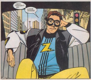
In Zenith: Phase Four, he was granted the use of color, and although his pen and ink technique has changed, his panel compositions remain boldly understated:

Yeowell doesn't fill the panel with needless crosshatching or distracting details. Even the background, which he's actually drawn this time, is composed of simple geometric shapes which provide the illusion of dimensionality without drawing attention away from Zenith's face. Yeowell once again uses a solid black geometric shape (around the rear window) to frame the foreground figure, and the figure itself is posed naturalistically. The "camera angle" from which the scene is shown is nearly identical to the example above. The reader sees the image not from some absurdly dramatic perspective, but instead, the figures are seen head-on, and we are looking at them at about shoulder or chest level, giving them a slight appearance of superiority, but none of this is highly exaggerated. It's subtle and effective and tells the story with clarity and grace.
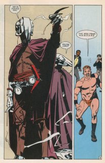
Even in the insane context of theDoom Patrol series, Yeowell provides clear storytelling and figures who are grounded in a simplified, but effectively rendered, reality:

His depiction of the Men from N.O.W.H.E.R.E. gave them a solidity that other artists weren't quite able to duplicate. Most other artists would obsess over the details of the costumes, distracting the reader with obsessively rendered chain-and-pocket-watch-belts, or overly ornate helmets. Yeowell suggests such detail but doesn't distract us with hundreds of tiny lines--instead, he uses blacks and negative space to add depth and texture. On this page, the lack of background information not only emphasizes the figures, but it provides a sense of disorientation for the characters as well. Flex Mentallo, in the right panel, is literally un-grounded. He is lost, emotionally, intellectually, and physically as he floats in the empty space provided by Yeowell. Notice also that the camera angle is again very similar to the two examples from the Zenith panels. We are slightly below the threatening Men from N.O.W.H.E.R.E, and slightly above Flex Mentallo and company, but not by much. In neither case are the figures shown from some extremely distorted or dynamic angle.
Steve Yeowell is the antithesis of the Jack Kirby model of comic book storytelling and the Image tradition of extreme rendering. That's why I personally disliked Yeowell's work when I first saw it as a teenager. It was so different, so apparently flat, from what I was used to seeing. But that's also why I enjoy his work so much now. I think Yeowell is one of the most interesting and effective artists working in the comic book medium, and I've only been able to appreciate his contributions now that I've matured enough to recognize his glorious subtlety.

No comments:
Post a Comment