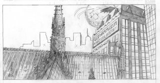
Because of this, or because I never finished anything I started back then (see Mr. Potato Head for details), I only drew the first panel for the contest. This is the result:

I wanted to amp up the gothic imagery in the cityscape, and what could be more gothic than Notre Dame cathedral? So I plopped it right down in the foreground and left the more modern buildings in the middle ground. I like how it turned out. It's certainly the most detailed architectural rendering I've ever done, and although I'm not happy with the old-school cape effect up top (looks more like Bob Kane than even I intended), or the way the right corner of the cathedral lines up with the front corner of the Natural History Museum (the cathedral should extend a bit further to the right), I think it's a cool image.
I mean, it's Gotham City! Right?
Although if I had to do it again, I'd definitely put some kind of giant dinosaur skeleton on the roof of the Natural History Museum. Nah, that would be dumb.

2 comments:
I've always been a customer of your Ninja Wolf Comics and I have seen Ninja Gerbal and Samuri Squirrel in full glory first hand, along with your other little sketches, but this one amazes me. Looking on this blog and seeing all your drawings, you have a serious amount of talent. The detail in this batman picture is staggering. I am in much awe of your work and my appreciation for it is immense. I love it. Good job Callahan! Keep it up so I can keep being impressed and jealous!
P.S. My first film will be out by the end of October...maybe I can come in period C and show it sometime and talk about the true film-making experience!
It has potential but the addition of the Cathedral almost seems like it was cut and pasted from another picture. The perspective of the cathedral and the building in the background are so disconnected all it really serves is to make me look for more problems. The details are immense (some a little blurry, I don't know if you use a mechanical pencil but I would suggest switching to a harder lead and a finer point) but again, your perspective for the picture is just substandard.
Post a Comment